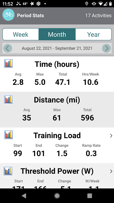
Simple graphing of any metric that make sense to graph.
Example: Time, Distance, Training Load, etc. for whatever header you have selected (Week, Month, Year).
There would be a graph icon you tap to view that metric in graphical format over time.
If Week is selected you see seven days worth of data.
If Month is selected you see a month’s worth.
If Year then 365 days of data points (or 52 weeks?)
Bar graph or line graph; whichever makes sense and is easiest to code as a general function within the app.
Nothing is rendered unless you tap on the icon so Period Stats would load quickly as normal.
Mockup –
I will let you imagine what the graphs look like. Nothing fancy or analytical per se. Just the base data as a graph. Cool to look at on your phone. 