Xert doesn’t use zones, so I assume you want to view strain distribution by low, high, and peak strain.
You can do this now (by activity) by selecting Progression tab then Stress chart.
How about a strain ratio chart displayed on the phone app when you select Period Stats?
When you tap Strain (XSS) the single horizonal bar would appear showing XSS distribution by strain levels. You could then tap to view prior weeks or switch to Month or Year views.
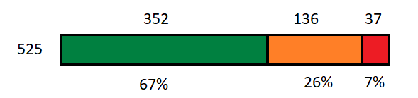
Example – Low High Peak Strain (XSS)
My feature request is to add a graph icon to Period Stats for any data set that makes sense to view as a chart –
Xert EBC Period Stats – in graphical format - Feature Requests - Xert Community Forum (xertonline.com)
Reference –
Sweet Spot, Threshold and Polarized Training … By the Numbers – Xert (baronbiosys.com)