Hello.
Is there some way to show chart something like that
in my weekly training stat.
Just take all my weekly rides and calculate time in zones a show graf for super easy check.
Thanks
Xert doesn’t use zones, so I assume you want to view strain distribution by low, high, and peak strain.
You can do this now (by activity) by selecting Progression tab then Stress chart.
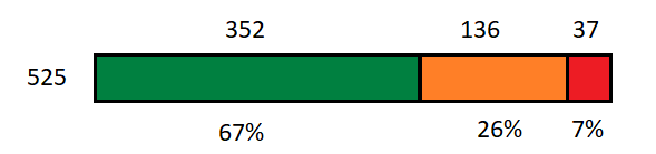
How about a strain ratio chart displayed on the phone app when you select Period Stats?
When you tap Strain (XSS) the single horizonal bar would appear showing XSS distribution by strain levels. You could then tap to view prior weeks or switch to Month or Year views.
Example – Low High Peak Strain (XSS)
My feature request is to add a graph icon to Period Stats for any data set that makes sense to view as a chart –
Xert EBC Period Stats – in graphical format - Feature Requests - Xert Community Forum (xertonline.com)
Reference –
Sweet Spot, Threshold and Polarized Training … By the Numbers – Xert (baronbiosys.com)
Thank you so much for quick help.
I found what i need in progresion chart acording to your instructions.
PS: I like you idea to feature request. Everything in chart bar with percentage is better for quick understanding.
You probably know already, but for the benefit of other readers, you can see that in Weekly Stats in the planner tab, just not graphically or over time periods other than a week.
Another option is to add a chart icon to the toolbar under Weekly Stats but that would get complicated as you would need to pre-select a subset of data to be useful.
I’m thinking Period Stats is the way to go. Everyone has their phone with them and everyone likes charts. ![]()
It would be cool if you could tap, tap, tap and see Time, Distance, TL, TP, Strain, Focus, or Energy in graphical format (line or bar graph) by week, month, or year.
Tap again to view prior week/month/year.