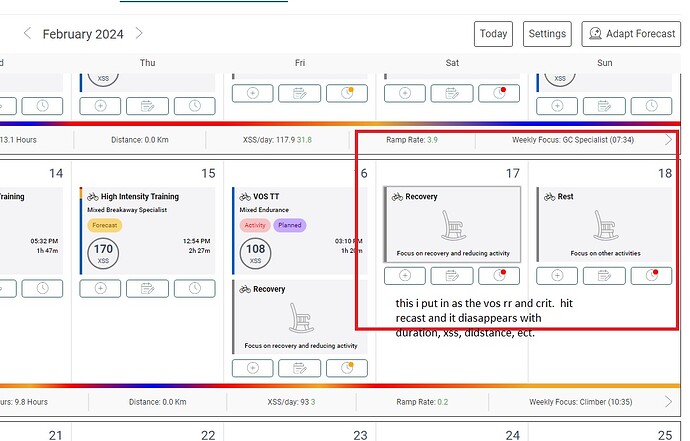
so i put in the races that im doing. i go to the date, click that i am unavailable for that date. add a manual activity based off of the activity from last year, like the bwr scottsdale. then the calcader looks right, i recast and that date is now scheduled as a rest day, along with all of the other mtb and road races that i just put in. says most of my weekends are unavailable.
I just tested this –
- Ran a forecast for a Goal improvement with a target date three months from now.
- Viewed Planner and (+) added planned “events” on a couple Sundays in the future by searching for rides that match those event activities. The Adapt Forecast red dot appears as soon as I add the planned activities.
- Selected clock icon and made those dates Unavailable making sure to uncheck apply as default for every Sunday.
- Ran Adapt Forecast.
- Planned activities remain with an additional entry on those Sundays labeled No Additional Training.
Im brand new to xert, heard about it yesterday… trying to figure out how to turn this AI forecast feature on. Any idea what im missing here?
I did not apply it to every week. just the dates in question. they all have red dots, not the yellow as default every week.
same with bwr scottsdale a couple of weeks later
I suggest you review my Onboarding post first then return here with any specific questions you have about FAI Beta.
Onboarding steps for Xert Trial users and newbies - General - Xert Community Forum (xertonline.com)
I haven’t been able to replicate your issue (yet), but I see a problem if I return my event Sundays to Available then Adapt Forward. The routine still thinks those Sundays are unavailable and inserts No Additional Training. Perhaps a bug with the Availability function.
I also removed the forecast using the Setup Guide with the two Sunday planned events on the Planner.
They remain and when I forecast again those Sundays events stick with the No Add’l Training entry added during the forecast. No red dot on clocks for those days.
yea… im a trial user, that must be why. Thanks!
This should now be fixed.
In the context of an ‘over reaching block’
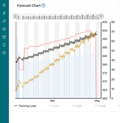
… what you say makes sense but doesn’t seem to be what is happening. The forecast seems to wait till I am green after the block, rather than blue, before adding training. I manually added 4 days back to back which leave me slightly red at the end. I would be blue the next day, however am getting 4 rest days. It looks like it’s waiting for my TL to drop down to what it would have been with a ‘normal plan. Some screenshots:
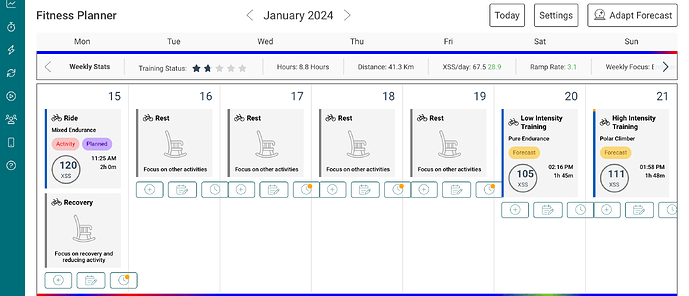
15th is the last day 4 back to back days and I’m ‘blue’ midway through the 16th, but have no training scheduled for another 3 days after that, when I’m green
TL drops to what looks like the linear trend line before adding more training… not sure if that’s because it is all that is needed to reach the goal, or if something else is at play… either the end goal could increase a bit, or training could get a bit easier over the remaining time, rather than adding 4 days off:
Our chief engineer explained to me that your explanation is correct. It still works to have you reach the target but as you point out, there can be some efficiencies and further optimizations gained. We’re looking into making some improvements as a result.
Very much appreciate your feedback and discussion. It’s helping us make some key improvements that everyone will benefit from. ![]()
![]()
Its is probably there but i cant find it. I dont ride mon, tue and fri. Is there a way to tell forecast AI this? I dont want see my planner with stuff planned when im not going to ride.
Thanks for that, i was using Firefox and for some reason the slider at the bottom had the title “default for Null” instead of default for Monday etc. I used chrome and was able to set what i want and now firefox has the right title too.
Hey, dont know if this was already asked and answered but I cant find the right answer:
If I have for example a 250 XSS day in der Forecast and I have time to do two sessions a day. Is there the posibillity to tell the AI that I want the day splitt in two sessions and still get trainings with optimal focus?
I have created a Forecast AI training program with Target Date = 110 days out; Specificity = Mixed; Focus = GC Specialist; Target Type = Goal. Other Settings are default. Current Focus Power = 200 W; Target Focus Power = 230 W. Even in the final 4 weeks of the forecasted program, every single forecasted activity is Low Intensity / Pure Endurance, except for 5 that are all High Intensity / Pure Pursuiter. (The preceding weeks of course have even fewer high intensity activities.)
Can this possibly be right? I would imagine that a suitable training program would have a lot more high intensity activity in the final two months, and that the focus of these activities would be predominantly GC Specialist or close to it. I don’t have a lot of confidence in this plan.
I would have thought that you could add rides and schedule times.
Are you basing that assessment compared to a standard XATA phased progression you’ve completed in the past? (aka 120 Day Program)
FAI takes things to the next level so I don’t expect the same progression pattern to apply.
There isn’t a function to track multiple activities against a daily target.
Endurance activity could be split up easily if you note the total XSS you need by end-of-day.
High intensity activities would be harder to do. Perhaps two similar focus workouts that add up to the desired total?
New user/subscriber here ![]()
I’ve spent a few days learning how the system works and have started looking at the forecasting ai beta. It seems to answer the first question I had when I joined the platform - “What will I look like on this date?”, so I’m happy to see this new feature.
Initial feedback from me is purely on the UI/UX. I understand this is a hard thing to get right, especially when you’re trying to convey as much information as the platform does. I want to highlight some pain points in my experience when setting up the forecast, then offer some suggestions as to how the issues might be overcome - I’ve tried to keep it concise. Disclaimer: I have some background in designing/implementing UI/UX, but it is not my primary role by any means.
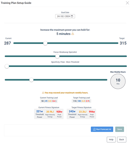
Looking at the main setup screen for a goal date:
Observation 1: My eye is drawn immediately to the 5 minutes with the exclamation mark - I completely miss the goal date above it.
Observation 2: I’m not sure what is causing the warning - I don’t make the link to the explanation below Max Weekly Hours yet.
Observation 3: Current power is fixed on the left of the slider, so to keep with this paradigm I’d expect the right to show the maximum value the slider allows, but it shows current value. It takes me a second to figure out what’s going on.
Observation 4: When I change Focus the power changes above it - conceptually it feels the wrong way around.
Observation 5: Sliders instead of dropdowns was a great, if not obvious choice - it allows you to see changes more easily. However, it’s difficult to track as your eyes are going from the slider down to target, across to current and then back - alignment is not optimal for comparison.
Observation 6: Being new, it takes me some time to realise that Current Training Load is showing XSS.
Summary: It takes some time to figure out what I’m meant to be doing ![]()
(continued from previous)
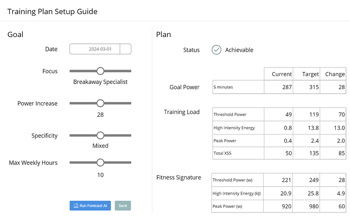
I had a go at replanning the user journey and came up with the following (obviously in wireframe format - add styling to taste, etc):
I haven’t deviated too much from what exists, just re-ordered and moved stuff around to suit the journey. All the inputs are grouped on the left side, whilst outputs are grouped consistently on the right.
Addressing obv 1/2: Date has the same footprint/presence as the rest of the inputs so the user naturally goes there first. The warning has also moved off to the right hand side and is designated as “Status”. There is no repetition of warnings and if the user happens the be drawn to that first, they will quickly reset to the Top Left. I’d consider setting the default goal date to something further out so that Status is not at warning and pulling your attention straight away. You could also leave goal blank and set status to a muted N/A or something similar.
Addressing obv 4: Focus is moved to second position, above power. As a user I want to set my date, my focus power, then the power value. A journey setting power before focus doesn’t feel natural, given that focus changes the power.
Addressing obv 3: Goal power type is displayed on the right. This helps keep the input area clear and concise.
Addressing obv 5: A consistent method of displaying output data: current, target and difference. Reformatting the data like this breaks some of the design precedents used elsewhere in the platform, e.g. Training Load, but I think it’s important to have it displayed functionally. When you’re ready to confirm, it could be displayed in the existing format, sort of like the final stage of an online shopping transaction.
Addressing obv 6: Taking advantage of new layout, just label it as XSS. Tooltips throughout would help too.
Summary: The demands are clear: fill the stuff out on the left - get to where you want on the right.
