I know that there’s a lot of data in the background, hidden from the user, and I understand that you don’t want to overwhelm the user with data. Having said that, one improvement to the interface I’d like to see is adding a visual representation of star colours and how they are derived.
In the mockup below, we have the last 7 days of Low Form vs High + Peak Form overlayed on the colours along with the projected next 7 days.
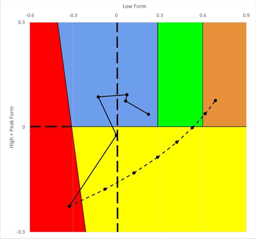
I think this would help people understand why they are being recommended the workout they are, and how Form can go straight from yellow to brown as it does in this particular case.
Thoughts?
Mike