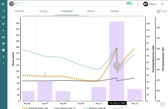
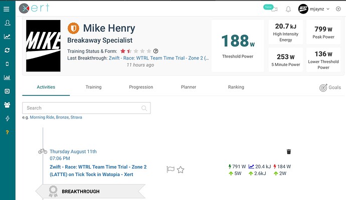
Can someone tell me why this breakthrough appears below my threshold and why the drop off in the chart?
You can have a BT event where one value goes up while another goes slightly down.
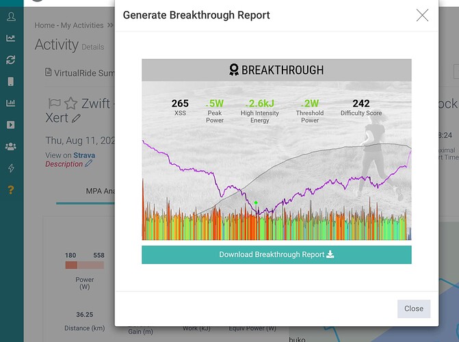
View activity details, click the badge icon next to Cycling Summary to generate the BT report, select download, then post that chart here.
Ok cheers @ridgerider2 here it’s is
I can find two instances of similar circle dips in my XPMC data from a few years back.
Like your example I had a low training load (1-1/8 stars) at the time and got a high difficulty score along with a silver BT.
How much historical data do you have on file for Xert to analyze?
Do the BTs shown include BT workouts from the library ridden for that purpose? Or are your BTs typically the results of a hard outdoor rides or Zwift races?
Someone else will likely chime in with more insight, but my first thought is your signature is not dialed in yet. You should try validating it when you are feeling fresh by selecting a BT workout from the library and ride it in slope mode (exceeding targets if able).
Note your PP/HIE relationship is off based on the chart linked below which is a normalized scatter plot (bell curve of all users).
Reference –
Are there errors in my Fitness Signature? – Xert (baronbiosys.com)
I only have about two months worth of data for dessert to analyse.
It only uploaded my recent Strava activities.
All of my breakthroughs have come from zwift races haven’t done any of the workouts.
Do I perhaps need to give it more time to analyse more data?
In my two instances it appears my PP was understated by several hundred watts at the time.
That straightened itself out after a couple BT workouts.
90 days or more of historical data is best, but that data needs to include sufficient maximal efforts under fatigue for the signature algorithm to work best. The alternative is to seed your data with those efforts now.
See this related post – Let's See Some Recent BT's - #252 by ridgerider2
Cheers @ridgerider2 appreciate the advice!


