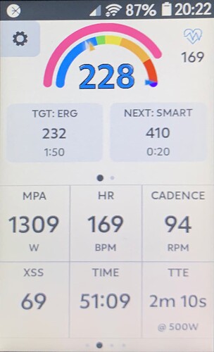
Dear Xert Forum
I had a few questions and a few suggestion for improving the EBC UI (in the Hammerhead Karoo app).
I’ve read the quick start guide, but couldn’t find an answer there.
Questions
- What’s the meaning of the blue arrow on the right side of the inner ring, see the image below? I’ve never seen it move nor could I find any information about what it’s indicating?
Suggestions
- I often toggle between “auto” and “slope” for short sprint type intervals. You can toggle between the modes, but currently you have to loop through all options. This makes going between “auto” and “slope” a bit cumbersome. The UI does allow you to change the metrics displayed in the cells. Can you add an option that a cell can toggle one of the modes? E.g., it would be nice to have single toggle (cell) for “auto” mode and another for “slope”.
- The getting starting guide screenshot shows heart rate in the upper left corner. On the hammerhead UI, this heart rate is covered by a settings icon. Can this settings icon be removed (or placed elsewhere)?
- The zoomed out vieuw of the workout has a single y-scale for the intervals and the MPA. Is it possible to split these up in two graphs? It’s difficult to see the difference between some intervals when your MPA is larger than your interval targets.
