I get all (?) the fields apart from Zone in the middle at the bottom. It climbs in value during the ride. so what is it telling me?
Zone XSS – This bucket shows you how much XSS you’ve accumulated in the ideal zone (75-100% LTP). You should aim to keep this number the same as the Low Intensity XSS number.
The % indicates how much time you spent in that Zone.
2 Likes
Thanks @ridgerider2
And the FAT data point? Is that XSS accumulated at Fat Max power?
I believe it works like this: Say you have done 200 Xlss (left side bucket). If 70 % of the energy comes from fat, then the fat XSS will be 140. The rest is carb XLSS, which they do not show.
You can also see the fat/carb split in the workout builder.
1 Like
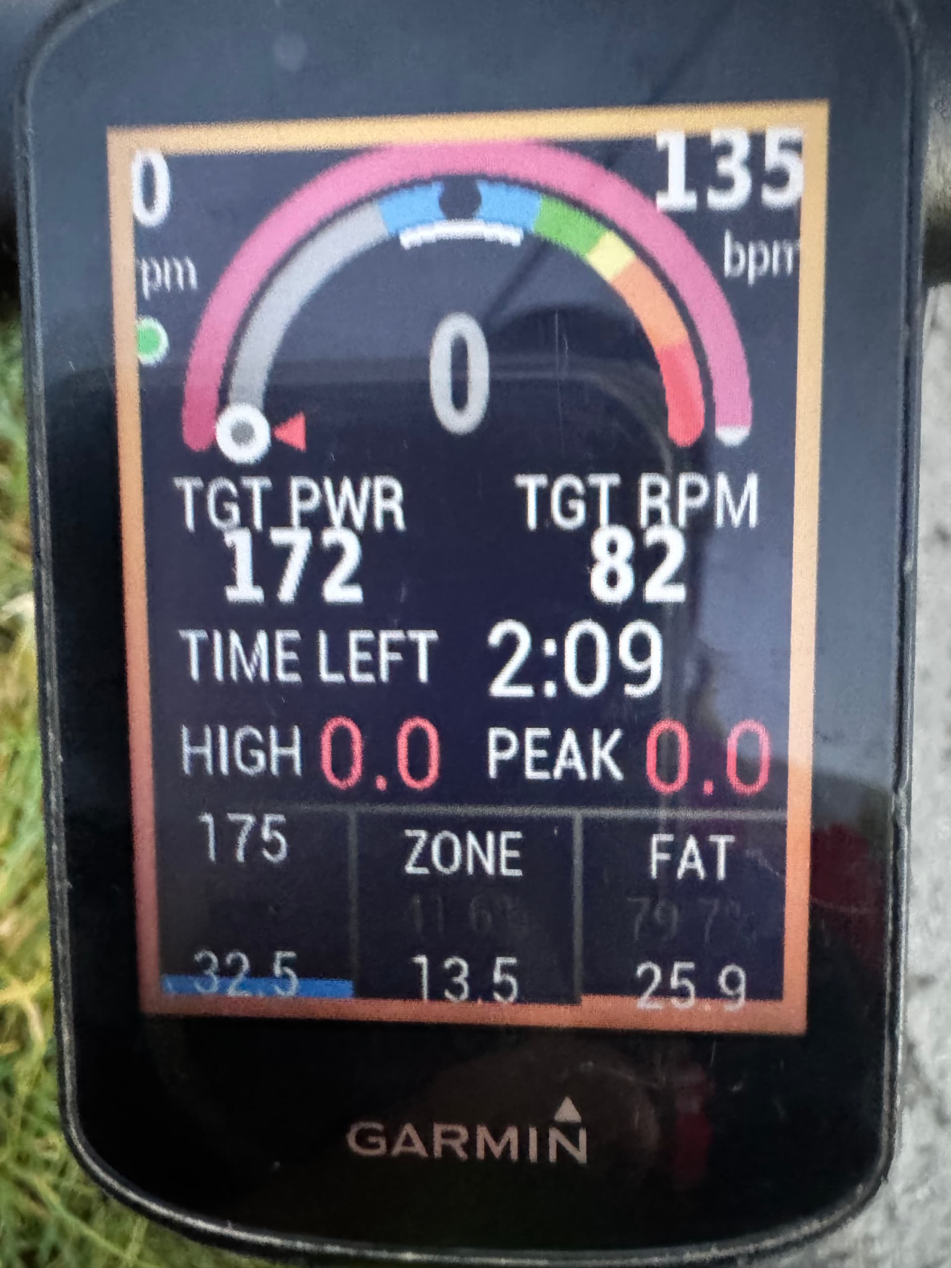
So that I have this straight…
TOP TO BOTTOM
RPM, BPM - self explanatory
FIRST PINK ARCH - MPA status as it changes?
SECOND MULTI COLOURED ARCH -
Grey - Sub LTP
Blue - LTP to TP
Green, Yellow, Orange and Red - supra TP with time to exhaustion associated with them?
TGR PWR and TGT RPM - self explanatory.
TIME LEFT - at the W output, it’s time left in the ride/workout to successfully complete the XSS requirements in LL bucket
HIGH and PEAK - self explanatory
LL bucket - LOW intensity (ie sub TP), with 175 being the goal and 32.5 the result so far
L MID bucket - XSS accumulated in ideal zone (ie sub LTP?)
LR bucket - Fat utilization %
So hypothetically, if the rider spends all their time sub LTP (in grey zone), then LL bucket would fill faster, and the XSS in LL and mid bucket ZONE would be the same, and the fat% would also be optimal?
Thanks in advance!
1 Like
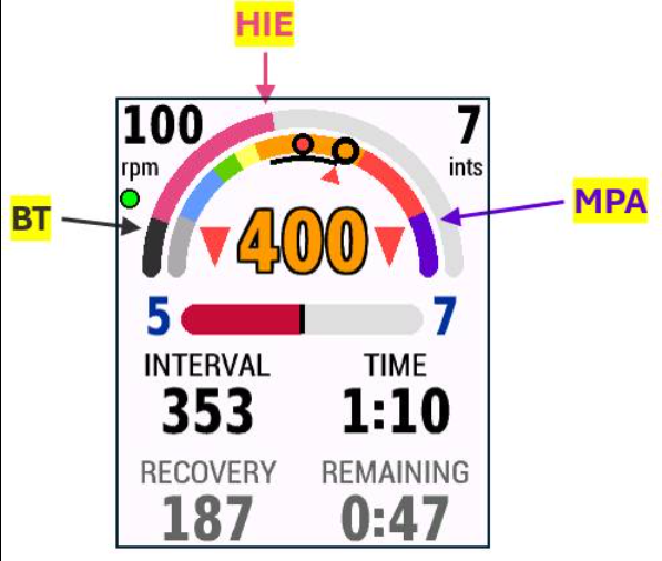
Posted on FB by Dave Brillhart –
The outer arc represents HIE. As you ride harder than TP, you drain your High Intensity Energy. The light grey is how much you’ve depleted. You don’t have to deplete it all to get a Breakthrough. We’ve added a dark grey sector to the left side of the outer arc. This is the Breakthrough HIE depletion level that defines a Breakthrough. When the light grey hits the dark grey, you are at a Breakthrough.
Your Challenge Level is defined to be how close the light grey is to the dark grey. CL=1 means you are 10% there. CL=10 means you hit the dark grey. In the image below, CL=6.0 and we are 60% to a BT. BTW, we use HIE rather than MPA, since HIE is a linear progression (MPA is an exponential).
3 Likes
Thanks Dave! (I assume this is the same for the Dashboard outer arc.)
There are a few differences between the magic Bucket and the Dashboard, but I understand Dave is planning an upgrade of the Dashboard based on the improvements made in Buckets.
You will notice that e.g. the circles are slightly different in the two data fields. They should be the same in the end in my opinion. And hopefully the same in the remote player and EBC in the end as well.
2 Likes
Currently the Dashboard arc reflects MPA drawdown like it works on EBC.
XMB has loftier goals with the arc performing enhanced functions.
I imagine one day the apps will standardize on the XMB format as @hpbieker suggests.
1 Like
So that’s how the breakthrough works on the Magic Buckets screen!
TBH it’s a complete mess here. Someone should write a decent manual and centralise all info. Right now if you’re new here and/or don’t spend a lot of time just browsing the forums, a lot of information is missing. It all feels like we’re paying beta testers for a product in development. Some stuff is in blog posts, others in podcasts, others on Facebook, some more here, and then things get outdated and you no longer know what to believe.
1 Like
I think this is a bit harsh. The app is coming along really well and of course there are challenges along the way.
2 Likes
Listen to the latest podcast and perhaps you’ll get a sense of what’s going over here in our labs. It’s really ground-breaking stuff and we are creating more content to help users. Note that there’s an undending supply of content on the internet about FTP, Zones, etc. written and recorded by hundreds (thousands?) of content writers. We’re just a small team.
4 Likes
It’s not about the specifics of training. It’s about how to use the Xert tools (such as the Garmin data fields). For instance: next to the READY state there is a time being shown. I can’t find anywhere what that time means.
That’s estimated time left in the workout. We thought that would be self evident but we can add something to our documentation.
1 Like
Just coming back to this. I think the OP has a good point. It’s a nightmare finding out what all the fields are telling us. One option you might conisder is a wiki that your community can complete. It would be a great place to put all this information and keep it evolving and up-to-date? Appreciate the work that’s gone into this project - it’s impressive, but frustrating when it’s hard to find the info you’re looking for quickly.
1 Like
I disagree. Everything you need to know can be found online on Xert under the help section. Also use Google to get pointed back to the Xert Help Docs.
Community driven content is how pretty much everyone learns about FTP, TSS, NP .. the old stuff. They don’t get everything from TrainingPeaks. I imagine the information on these from TrainingPeaks is probably less than 0.01% of all the content out there.
So although we’d love to have better and up-to-date documentation and videos on everything, we can’t possibly do that ourselves and still have time to get new features out (and be profitable enough to stay in business). There are some great content providers out there like Smart Bike Trainers and RoadToA that have made some really helpful videos.
But the idea of a wiki is something I’d love to see (I mean really) and would be all for that. Then it could be kept up to date but various people and vetted by the community rather than by us.
Having said all this, ChatGPT seems to be doing a pretty good job of answering questions on Xert if you ask it. It used to hallucinate quite a bit but that seems to have stopped. I wouldn’t hesitate to ask it a question about Xert you’re looking to understand better. (Aside) Some of our competitors have posted reviews of their software vs. ours that they make readers think it was written objectively. These have made into ChatGPT as real comparison content. That’s pretty poor business practice if you ask me but it is what it is. I wouldn’t trust ChatGPT to provide a comparison as a result.
1 Like