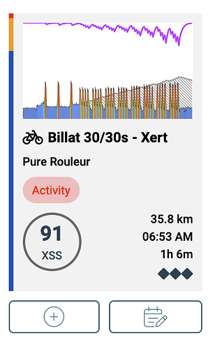
Do we really need the “activity” vs “workout” label on planner items? It doesn’t seem useful or accurate (I can do a Xert workout in Zwift which somehow makes it not a workout) and also it doesn’t align with the recent activities index which calls everything activities anyway. Also you can see pretty quickly in the thumbnail if the activity had intervals.
I agree this is not the best way to utilize the space.
I think all my rides are listed as activity anyway because I don’t use the Xert app.
Good point. What’s the intention here? @ManofSteele @xertedbrain
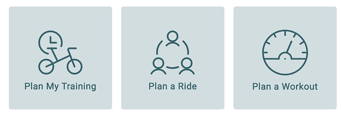
Plan My Training = XATA with recommendations; same as Training tab page
Plan a Ride and Plan a Workout = overlapping functionality for sure but you can quickly add one or the other to the Planner when you have no intention of following XATA. If you enable Favorites only for rides and Liked only for workouts, you’ll only see those listed so it’s similar to the old Planner in that regard. ![]()
Don’t beat me up. I know drag and drop needs to return in some fashion to make everyone happy.
I suppose so but make that Add a Workout since any source applies (Xert, Community or Personal library including custom workouts and imports).
EDIT: You can Add to the past or Plan for the future. Works for me.
Looks like the terminology used elsewhere is “Standard, Community or Personal” so I think it’s OK, they are sources for Xert workouts.
This can be confusing to those coming from TrainingPeaks (where everything is a workout) or from Strava (where everything is an activity).
In Xert, we make a distinction between the two. A recording is always an activity (like Strava). A workout is a set pattern of intervals that offers some structured training. It’s more like a template for an activity you plan to do.
When you do a workout with Xert’s apps, Xert recognizes that you did a set pattern and matches the activity with the workout that was performed on the system. If you don’t use an Xert player, the system treats it as a regular activity since there is no information in it to tell the system what workout you performed.
Many of our users use our workouts as part of the everyday training. They like to choose workouts and do them and also see them on their planner as being performed. “Plan a Workout” is for them. Other users don’t do workouts and just like to ride without them. “Plan an Ride” is for them. Other users like to follow the advice of the Adaptive Training Advisor where you can choose to fulfill the advice using an activity or a workout. “Plan my Training” is for them. Of course there is a bit of overlap but some users like their own stuff and favourites for planning (activities or workouts) whereas other just want to follow the advice of XATA. Hence the different options.
I would say wherever there is an overlap there is a need for simplification.
And don’t get me started on workouts vs sessions!
Some easy to use tools for future consideration:
Thanks for that @guyc . We’d love to be able to do more user workshops. We’ve talked about this a lot and would be great to hire someone to run these for us. We do them more adhoc as I’ll spend time with various users and coaches. Most just say they love things! ![]() and don’t see things as particular difficult to use on the system. It’s really not that complicated in the end as a software tool. Conceptually, yeah. There are many new concepts and getting these across isn’t so easy. The existing vocabulary on training is over simplified and doesn’t align with what we’re about. … and we’re the only ones that are trying to educate users. Everywhere else is about FTP and Zones and all the old stuff. Wouldn’t be great if GCN did videos about MPA and signatures rather than FTP testing and Zones? Wouldn’t that make it so much easier for our users?
and don’t see things as particular difficult to use on the system. It’s really not that complicated in the end as a software tool. Conceptually, yeah. There are many new concepts and getting these across isn’t so easy. The existing vocabulary on training is over simplified and doesn’t align with what we’re about. … and we’re the only ones that are trying to educate users. Everywhere else is about FTP and Zones and all the old stuff. Wouldn’t be great if GCN did videos about MPA and signatures rather than FTP testing and Zones? Wouldn’t that make it so much easier for our users?
For me, I’m also very interested in understanding why people don’t use the system. Those users are much harder to understand. Perhaps some user experience simplifications would help here.
I am TrainerRoad user (used it for two years), but also subscribed to Xert from time to time to test it out, but then remember why I am not using it.
- Indoor workout player. I do almost all my structured training indoors (and also longer endurance rides in the cold season). I have a dedicated MacMini and 40” screen that I use to follow my training. With TrainerRoad I have a nice MacOS app, Xert only has a web-based remote visualization that I can put on the screen. And there is no way of resizing it so it only takes up minimal space on the screen when doing an endurance workout.
- Garmin sync. If I do the workout using Xert, it will not be properly included in Garmin Connect so my metrics there are updated. It works well with TrainerRoad.
The two items above could be fixed for me if I could easily get workouts from Xert to TrainerRoad, but now there are a few manual steps.
To me TrainerRoad works very well from October to April. But then it breaks down as I want to do as much outdoor riding as possible. With Xert you are better paced to a certain volume, with TrainerRoad you just get prescriptions, but if you do less or more there will be no adjustments in the upcoming volume.
I generally do the high volume plan from TrainerRoad with some additional zone 2 on the top. My thought was that I could combine the system where I could use Xert to steer the additional demand using the pacer.
Also, Xert’s user interface is cluttered and busy. It is possible to work with, but I always get the impression that the UI is done in a certain way because it was easiest for the developers, not because this is how it is best for the users. I have came with multiple examples previously. But the response I read from Xert is that the current solution is good and UX shouldn’t really matter anyway. So the interest of making it easier and nicer to use is not really there.
What makes this extra confusing, is that i get the same recommended WO when clicking on plan WO or plan a training (“now”). I ntuitively id think plan a ride is when you want to plan an unstructured ride (for me that would be outside). For training vs WO illl need T
to grab your post everytime because they seem synonym, cant make up the difference from the interface (and if they both recommend the same, whats the point learning the difference between both in the first place…)
100% this is your USP, and completely lacking in the rest of the options out there. It’s the only platform that can actually model the physiology that Seiler and the rest of the big brain endurance training folks talk about.
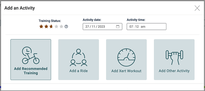
I’d say in this particular case, the options, when I choose to add something to Planner, could be more explicit, and clear. As you say, ‘Activity’ is a thing in Xert, along with ‘Workout’. The modal that pops up introduces ‘Plan my Training’ and ‘Plan a Ride’, which don’t exist elsewhere in Xert. How about ‘Select a Workout’, ‘Autogenerate a Workout’, ‘Schedule Other Activity’, ‘Select a Previous Activity’? They’re each a bit longer, but they’re more clear, and don’t introduce new terms.
I second that you should use the same terminology in the different screens. Also, if not strictly required, use the same terminology as used by other major apps. You have also included some icons over the text, but they do not really tell me which button to use.
I assume “Plan a Ride” is supposed to make it easy to replicate a previous outside or virtual ride? If so, I think they should adjust the wording to fit that.
Furthermore, the activities you list should then only show activities with GPS data. Here it will show all my previous indoor workouts because they are not recorded using the Xert app.
And if this is the purpose you should also make it possible to search activities near the current location ( adjustable) so you do not get suggestions from your latest vacation every time you want to ride.
Thanks @hpbieker @jjamesv @Blouies @guyc @ridgerider2. We’re considering some changes with the aim of making things a bit simpler based on your feedback.
That is good!
I think it also would be nice if you put future plans or constrains in the calendar. Currently Xert Adaptive training is really reactive. Suggestions are always based on what you have done, not what you will do in the coming days.
Say I will not be able to train the day after tomorrow because of some job commitment. The suggested training for today and tomorrow should take that into account and allow you to become more tired than what it normally will allow because you will have an extra day to recover.
This is a bit inspired by JOIN where you set your availability for the coming week every Sunday and the plan is suggested as you go based on what you complete.
Doesn’t the Safari browser allow pop-outs or sizeable windows on a MacMini?
Or is the issue you don’t want to run EBC on your phone at same time?
Maybe a bit off topic, but the remote player has most of the same issues the rest of the website does. Overcomplicated, lots of buttons to click or windows to pop up, two different remote players with overlapping functionality. I raised this ages ago but functionality-wise it also needs interval audio beeps (TrainerDay has this on their remote player so I doubt it’s that hard to implement).
For JOIN, if am not wrong, once you set those availability for the week and happens that you have more time for today and did a workout, it will recalculate and change your next following workout, am i right?


