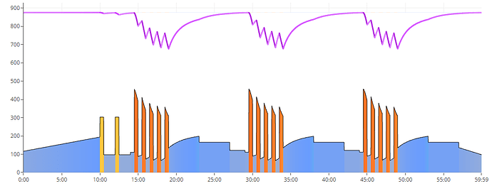
Hi, I realise I’m repeating myself but I wanted to make the point that I feel the new colour scheme which models the low, high and peak intensity values more closely has led to a very bland overall look in my opinion and is less useful when fine-tuning power intensity values to HR (thinking: input/output).
When training at the lower (low) level of power where there is a big difference between say easy endurance and more challenging ‘high’ endurance near LTP, the colours blend into relatively indistinguishable blues:
Yellow now needs to be renamed:
And workouts that were fairly balls to the wall for a non-sprinter like me are all just orange now - boring!
…And those recovery under fatigue intervals just look like standard endurance.
I know the idea is mapping this stuff to buckets and all that, but it seems that accuracy of the Xert philosophy has been implemented at the expense of a more useful diagrammatic UX.
Ok that’s it - I won’t keep banging on about it - but is there any chance of enhancing the colours slightly to break out the low, high and peak into a wider spectrum?
Thanks for listening!


