My understanding is breakthroughs are instances where you apply 5s power in excess of your MPA. When I get those, I am getting the breakthrough banner in the label for the pertinent workout in my activities dashboard.
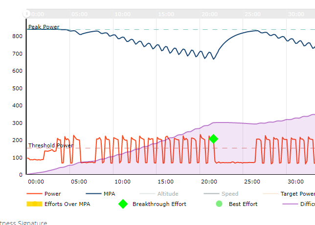
But I also have several sessions where there was plainly no breakthrough, but the power/data chart for the session has a green diamond labeled “breakthrough effort”. In case the image I’m trying to post does not show up, what I mean is that a point on the power curve, usually the last of a set of efforts, will show a green diamond, although the MPA line is still far above the power line. What does that signify, and is there anything I should do about it to make sure my signature remains valid? Don’t want to start flagging and ignoring sessions if that is actually not an “error” and can be left alone.
Thanks for any advice or explanation.
Hi James,
This is just a visual bug. The green breakthrough diamond should actually be the duller green ‘Best Effort’ circle. It’s something we need to address on our end. There is no need to flag these activities.
Cheers!
Best Effort and Breakthrough Efforts need to be completely different colours.
2 Likes