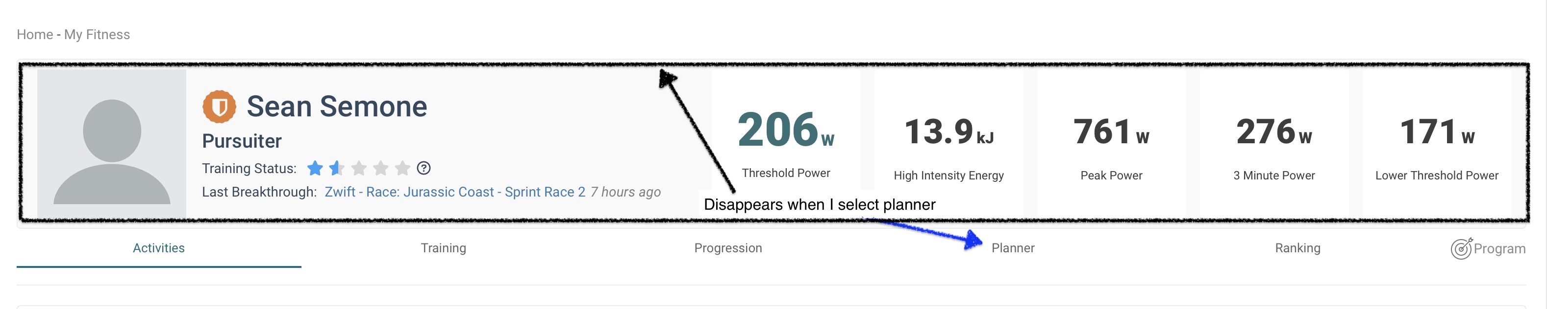
I wonder if it would make sense to keep the mini dashboard in place across all of the top tabs. Currently it displays for all of the menu items except for “Planner” which always catches me off guard. Perhaps there could be a show/hide selector for that part of the UI so that it was sticky for all of those top menu items (or for none).
Let me know if I am not explaining this very well!
I understand the reasons. On the Program tab, the data is duplicated in the fitness signature widget specific to the Program feature, and it takes up space. On the Planner / Calendar tab it’s about the space.
However, since the fitness signature header is the content that appears and disappears across different tabs, I think it would be better to have the tabs rendered first - always at the top of the page - and the fitness signature which may or may not appear to be below the tabs. That would give a more consistent navigation experience, rather than having your navigation links jump around the page depending on what page you are viewing. The tabs are also currently visually deemphasized by using a small font and lighter color than the regular text on the page.
I think there is still room for improvement in the design of the fitness signature header, regarding efficient use of space. E.g. the athlete type, training status, breakthrough are pushed down further than need be by the subscriber graphic. If the athlete type were more directly under the athlete name, or the subscriber graphic size reduced, a small amount of vertical space would be gained. There’s already padding / margin space between the largest elements in the F.S. header (the profile image & numbers boxes) and the background color / container for the header - then there’s empty space above the user’s name and below the breakthrough.
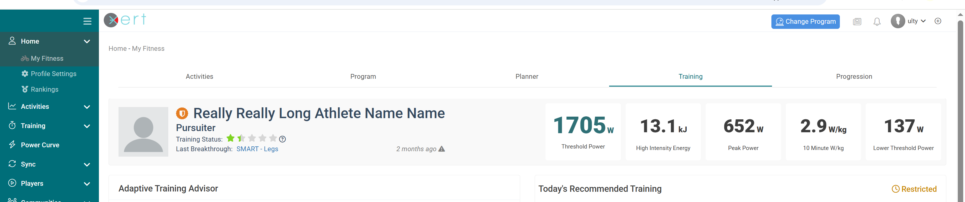
E.g. It could look something like the screenshot below