I’ll start this by saying I love training with Xert, but, the front end of the IOS App and the Remote Player is at best, a chore.
Are there any plans to change/update it?
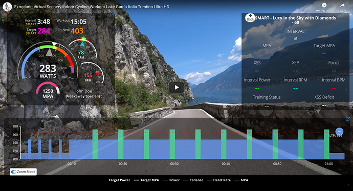
It should be possible to see every bit of information possible/available on a single screen in a clear and concise manner, at the moment this isn’t even really possible using 2 screens, the info is there but even using both the IOS App and Remote Player on a tablet at the same time it’s not nearly as clean/clear as it should be.
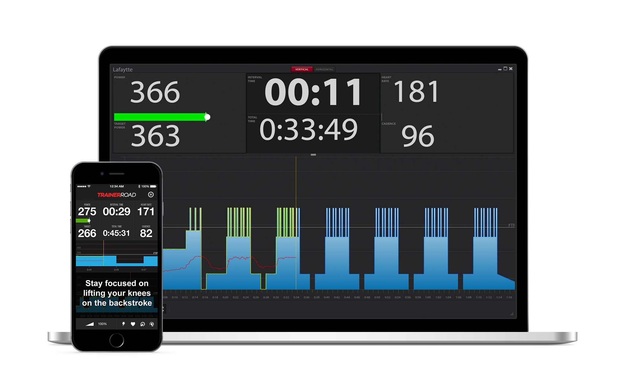
TrainerRoad manages this so much better than Xert and it’s a real shame, in fact, I’ve paused for a second and wondered whether the training is all it’s made out to be as the Front End is such a miss.
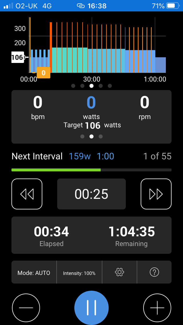
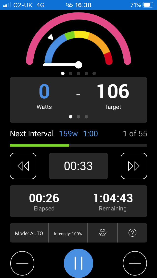
For example, on the IOS App I can either see the graph of the planned workout or the gauge with MPA, if I wish to see MPA with the gauge I can’t see HR/Cadence. When using the remote player I can’t see the gauges and the graph at the same time and the gauge screen doesn’t have the interval length or the length of the next interval, these are all fairly embarrassing and major oversights IMO and taint the use of the platform.
It’s very inconsistent: it varies from data field to data field what happens when you long-click it. Most can’t be customized. Maybe customization wouldn’t even be needed if the default layout was better, but like you it didn’t have what I needed.
Theres a pink ring on the power gauge. Not even the docs know what it is for.
Do you run the mobile app in portrait or landscape view?
On the Android app I swipe back and forth between workout and activity screens and tap the graph to zoom in/out. I wish there was a middle view for the graph that shows just the set you are on. Otherwise all I really do is listen for the transition tones then glance at the screen. MPA as a number works fine IMO.
Do you want something like this for the Remote Player? (the beta version)
I shouldn’t have to scroll, zoom or do basically anything, all the info I need should already be on the screen, TrainerRoad manages this in a much cleaner, easier to read manner and I miss it, eg,
Switching between portrait or landscape didn’t really seem to change which fields are displayed (Android). I mostly use portrait.
I want the overall workout graph, power, (recommended) cadence, HR, time left in interval, and time elapsed or remaining. Like the default view of Sufferfest or TrainerRoad or any other app. But that combination of fields can’t be gotten in Xert in a single screen.
I think the screenshot you give also shows exactly those fields, so I don’t think this is a strange request!