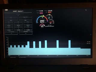
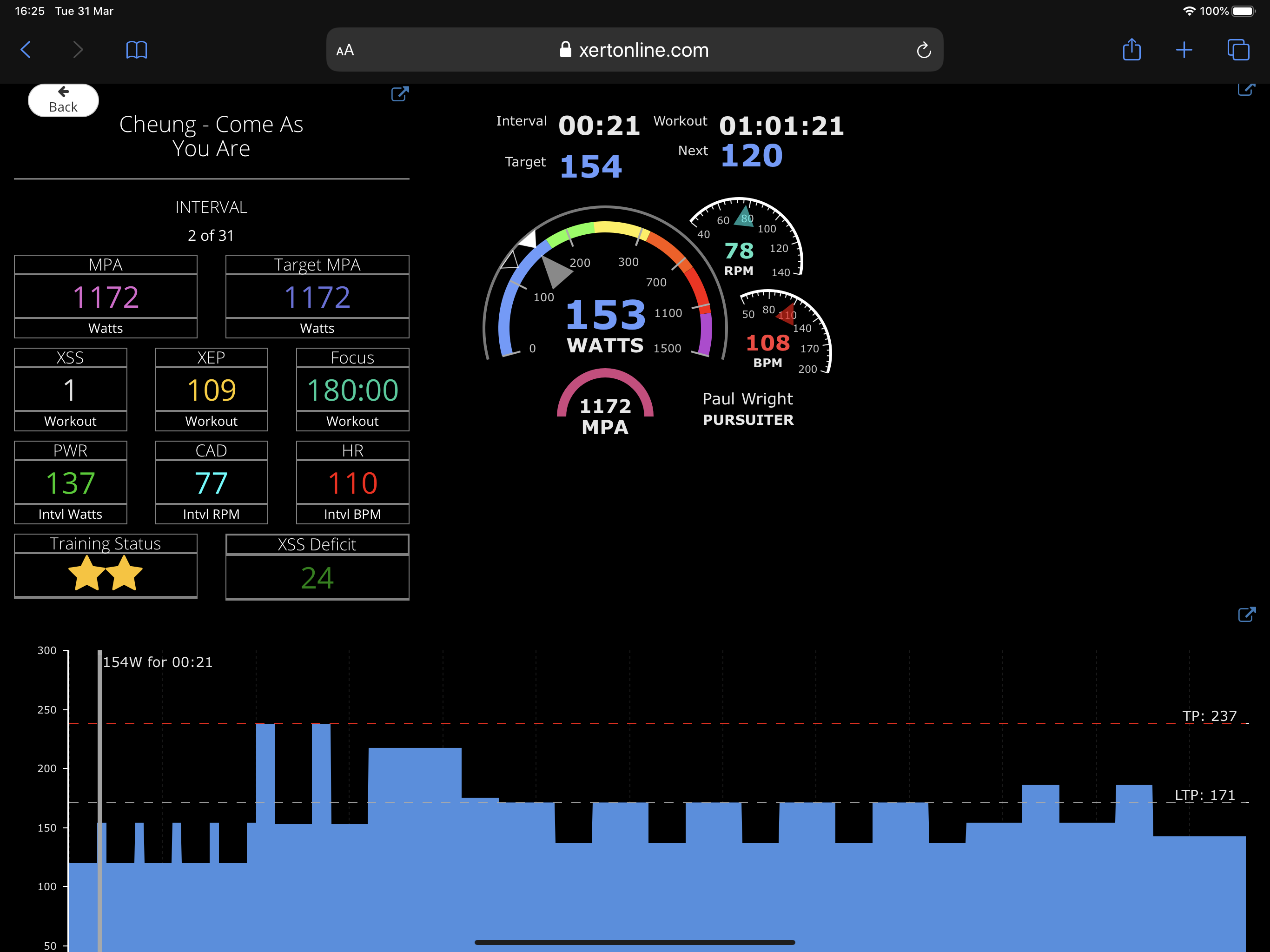
Since the website upgrade it appears the gauge graphics area on the Remote Player are a little smaller. I was wondering if anyone has any hints on how to make better use of screen space when using the player? Currently, if I zoom out in order to capture everything, it leaves a rather large empty space in the upper-right corner.
This looks like something Xert needs to tweak on their end.
I agree. Gauge graphics section should be bumped up larger to fill the box.
Same height as the stats box should work well.
I’ll mention something to the tech support team, maybe there is something we can do about auto-sizing the gauges in the future (I’m no tech expert, so not sure if it’s possible but it’s worth mentioning). If you’d like, you can pop each of sections out into a separate window and resize them as you’d like. It’s a potential alternative for the time being.
I was just about to make a thread with the same issue, prior to the (great) website UI changes of the last week, the “rev counter” bit fully filled the box it was in, now, same for me- it no longer scales and sits top/left in its allocated space. I’m struggling to read the data on an iPad screen mid workout. If that particular bit can be tweaked to how it was that’d be much appreciated.