Hi,
I have only recently signed up but noticed when looking at both my rankings and power curve that they don’t match other applications that show my historical data/power outputs for given periods of time. Some of them are higher than my actual best recorded power for any given time and some of them are lower. Is there a reason for this discrepancy and is there a way to fix it?
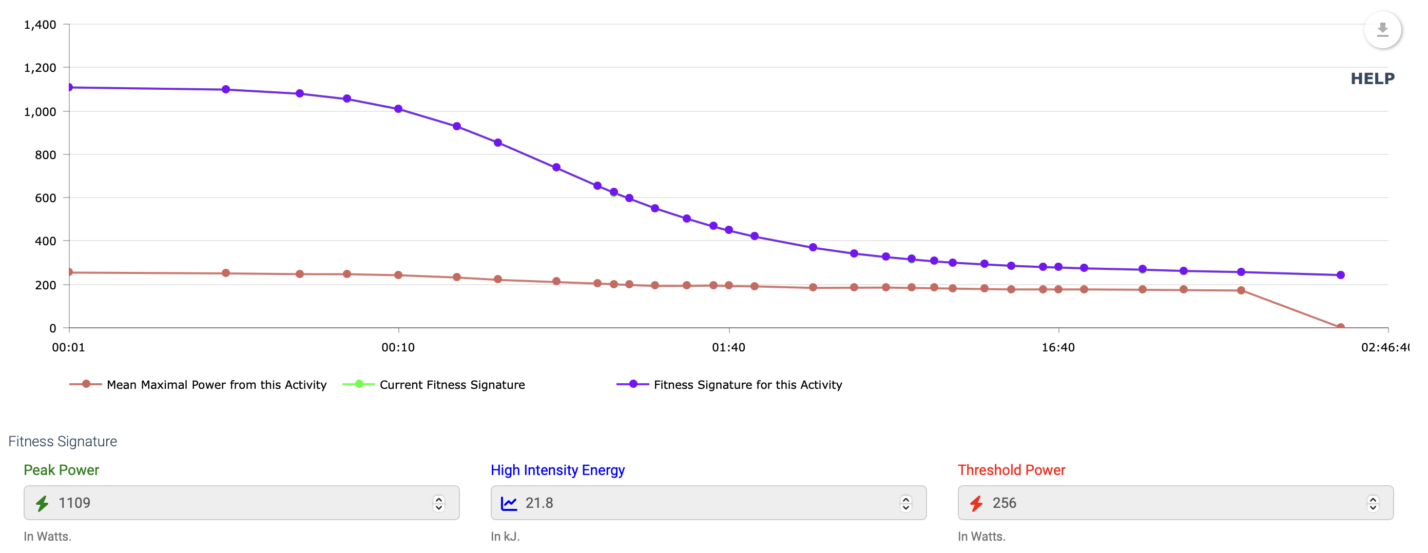
Are you referring to this power curve? The red line will show your actual mean maximal power (MMP) from the activity, while the blue (green) curves show the derived maximal power, based on your fitness signature at the time (or current fitness signature).
Unless you have a perfectly-paced effort from fresh to failure, then the curve derived from your fitness signature will always show a higher value. Think of it as being the ‘best possible power’ versus your actual best MMP from the activity.
The rankings tab will show your estimated power curve using the fitness signature calculated from your last Breakthrough effort. If you’ve been training diligently and it’s been a while since you’ve achieved a BT, then it’s probably underestimated.
HI Scott, thanks for your reply. I’m more referring to the rankings plot:
The numbers when you hover over each black dot don’t correlate perfectly to my historical best power data from Strava/TrainingPeaks etc. Wasn’t sure whether the numbers plotted here were maybe based off normalized power rather than average power?
The same applies for the green power curve, the numbers don’t quite correlate to what is recorded on Strava/TrainingPeaks.
Just didn’t know whether Xert may be measuring different things (eg. Normalised power vs average power)?
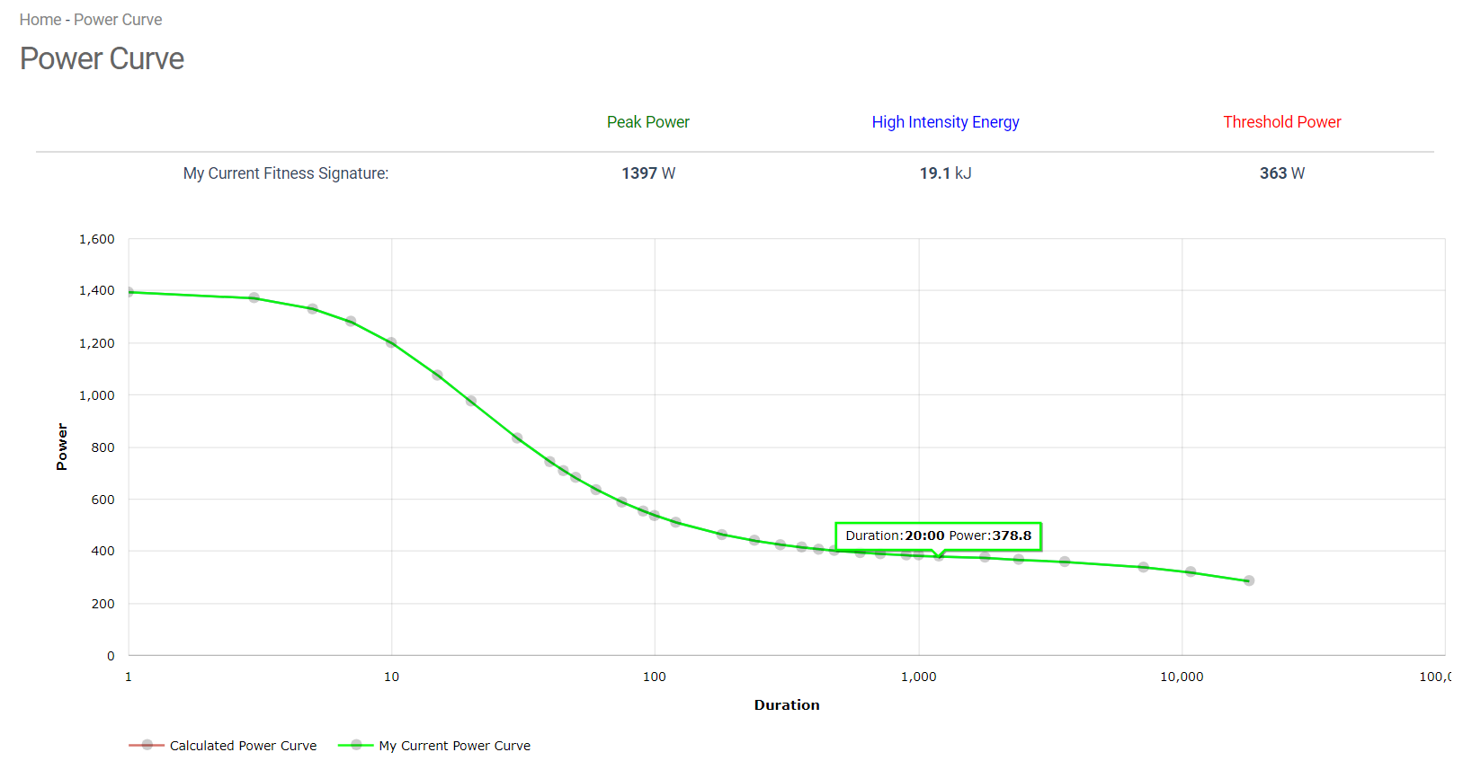
My Strava and TrainingPeaks data both suggest my best 20 min power ever recorded is 345 Watts. Just trying to understand where the discrepancy is coming from given that Xert captures it’s data direct from Strava
The curve you’re referring to isn’t showing your historic MMP curve - that’s already available many other places and isn’t always meaningful. In fact, there’s many cases where you can achieve a fitness breakthrough without setting a new ___ min power PR.
Instead, Xert uses MPA data to calculate the highest possible XYZ min power that you could achieve, given your unique fitness signature.
Thanks for clarifying Scott. I assume therefore that the numbers on the ranking plot are the seame. Not Historical MMP/Power numbers, but more showing what numbers you could achieve based on your MPA data?