Please explain the Progression Chart purple bars

I don’t understand the purple/lavendar bars in the Progression Chart. I’ve Googled, searched here and read various pages on http://baronbiosys.com, but none has explained it. It’s probably obvious, but I’m new to anything like this.

Looking at the following examples:

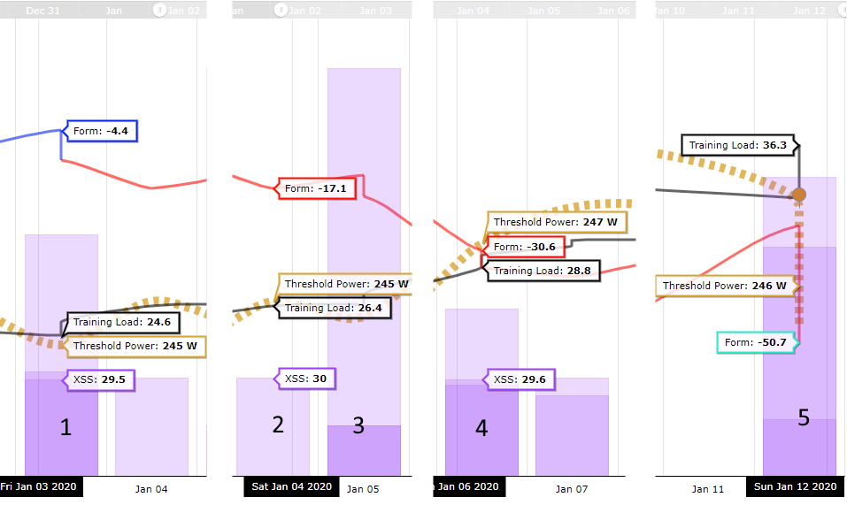
I’ve worked out that the XSS tooltip normally has two values associated with a bar. However, I don’t know quite what the coloured segments mean.

Sometimes there are three (bars 1, 4, 5). Sometimes two (bar 3). Sometimes just one (bar 2).

When there are three segments, sometimes the XSS tooltip aligns with the top of the darkest segment (see bar 1). Other times it aligns with the top of the middle segment (see bar 4).

Sometimes the middle section is very narrow (bar 1 and 4); sometimes wide (bar 5).

There’s no tooltip when hovering over the right-hand half of bar 5.

Edit: Today there’s now a tootip on the right half of bar 5, so I guess it’s something that can only be calculated for “yesterday” and earlier.

Today I’ve also noticed a new thing I don’t understand. Normally, the XSS tooltip value is lower on the left than the right. But today I noticed that the values for Jan 10th are the other way round - highest on the left (24.7) and lower on the right (20.4):

image

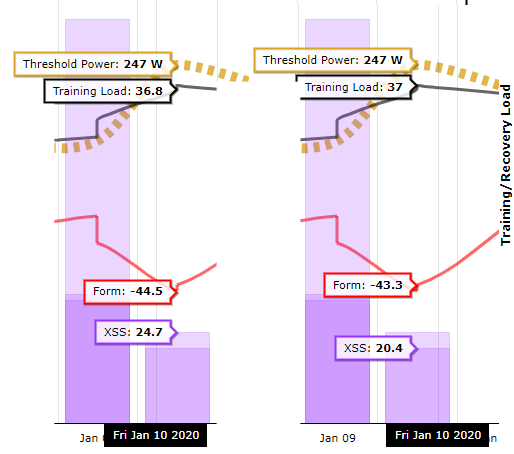
The 4.3 difference doesn’t seem to tally with anything like a sum of the differences between Form and Training Load.

Please can someone explain it to me, or link to the page that does explain it?

Cheers!

2 Likes

Daren, welcome. I recognise your name from the Zwift forums.
An excellent iagram there makes it easy to understand what yoiu are saying.

By any chance did you do multiple workouts on days 1,3, 4, 5. WHen I do that I see the different colours and the individual sums of XSS which add up to my daily total.

You can check that by looking at your planner page.

2 Likes

Hi @johnnybike, yeah I’m trying to get more competitive in the B races on Zwift (as well as training for the Dragon Devil in June). First foray into any sort of structured training, so it’ll be interesting to see how things go.

Yes, there are multiple activities on those days. Generally I commute to work for example, so there might be two 11km rides as well as a Zwift ride.

On Sunday Jan 5th for example, There are two stacked bars, but I did three activities:

Yorkshire - badge unlocking warmup 16 XSS
Yorkshire - badge unlocking warmup two 16 XSS
Zwift Bambino Fondo 127 XSS

I think this makes sense to me now. The bars aren’t showing an aggregation (e.g. 16 XSS + 111 XSS = 127 XSS). They’re showing the individual XSS scores aligned to the baseline, and the two with 16 XSS are sitting on top of each other so they can’t be differentiated in the plot.

OK, cool. That at least seems clear enough.

I’m still not sure why sometimes the “left side” tooltip aligns with the lowest activity (Bar 1) and other times now (Bar 4). That said, having gone back to check it’s still doing it, I’ve only got two bars on Jan 3rd now as two of them have been reassessed as 32 XSS anyway.

I think I’ve worked out that the “left” tooltip is the XSS from the first activity that day, and the “right” tooltip is XSS from the last activity. So it makes sense in some respects, but if I did something like 30, 100, 30 I assume I’ll get a “30 XSS” tooltip for both hover positions, and none that says “100 XSS”. It might not be like that at all, but I can’t check because that chart seems not to allow me to go beyond the start of the calendar year (which seems an oversight to me).

Maybe it’s highest and lowest in whichever order they occurred.

Anyway, making more sense now, thanks for setting me on the path to enlightenment. :smiley:

1 Like

Scratch that. Seems to go back to October now. shrug

Edit: Aha! I think this was because on one computer I have Period Statistics set to two weeks, while another one has it set to 3 months. The period seems to be stored in Local Storage rather than my cloud profile.

1 Like