Meaning on the colours on my Garmin

I have on my Garmin, while riding, the datafields:

  • TTE 5time to exhaustion) and TTR (time to recovery)
  • Focus
  • Difficulty
  • Power
    The values of these fields change from colour. Blue, green, yellow, black …
    When which colour? Is there somewhere an overvieuw?

There is a description in the IQ store for each data field as you install them.
Or use this link: https://apps.garmin.com/en-US/search?q=xert&device=&deviceLimit=&appType=&sort=&start=0&count=30

1 Like

We can likely create one post that describes all the colors (and features of the Garmin ConnectIQ datafields). You can also check out the latest podcast to learn about them as well!

Cheers!

Thanks, I found the necessary answers!

Podcast episode 9: it wasn’t there.

Should be episode 13 :slight_smile:

Link here:

Thanks for this link. I didn’t knew…
When I go in my Xertonline -> tab ? -->XBL -Podcast -New I only get the episodes 1 to 9.
I didn’t knew there were more. When I launch a chearch on my iphone:I get all the podcasts.
Possibly there is something missing in Xertonline?
Thanks anywhere

When you select XBL Podcast in the left menu of Xertonline it links to:


That website page lists the first nine podcasts starting with Episode 1.

If you select “Xert Breakthrough Lab” from that page or SoundCloud it goes to:

That site lists all the podcasts in descending order, most recent to oldest.

Perhaps they need to add a link at bottom of the baronbiosys page called More Episodes.
Otherwise visitors may think there are only nine episodes.

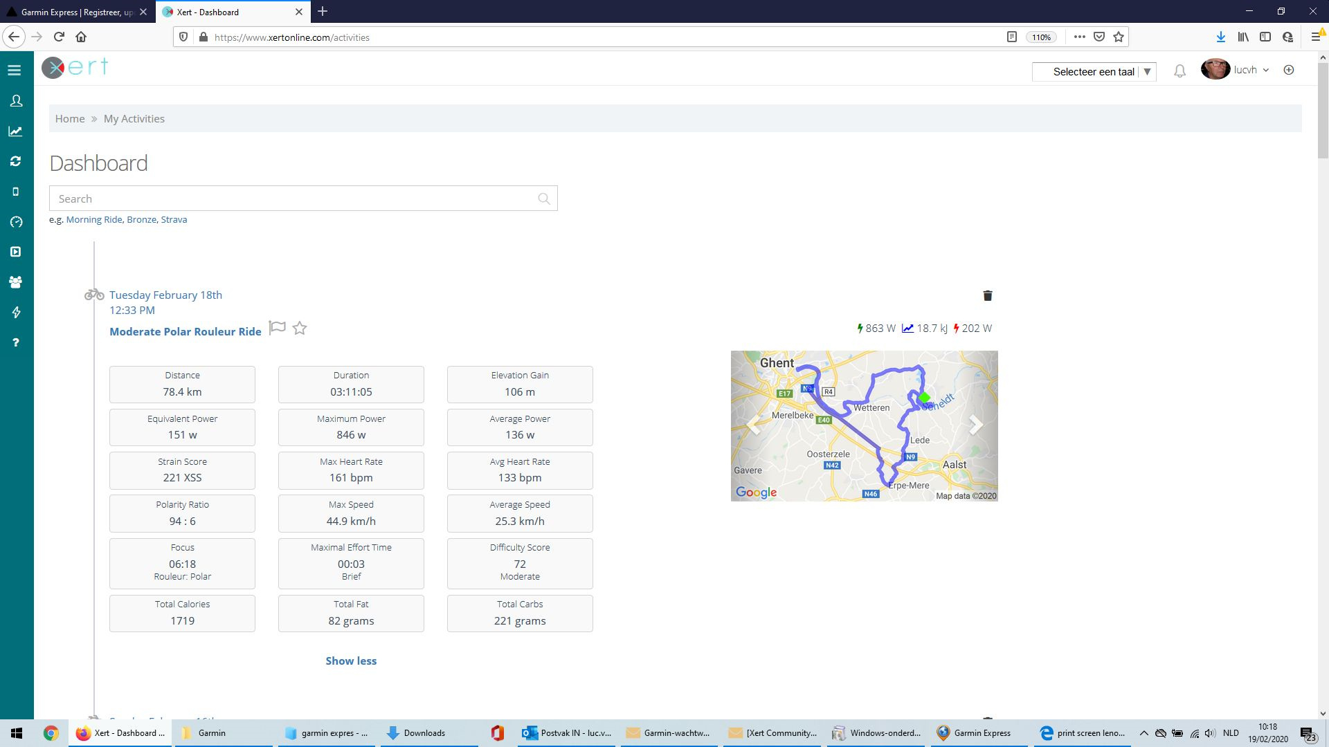
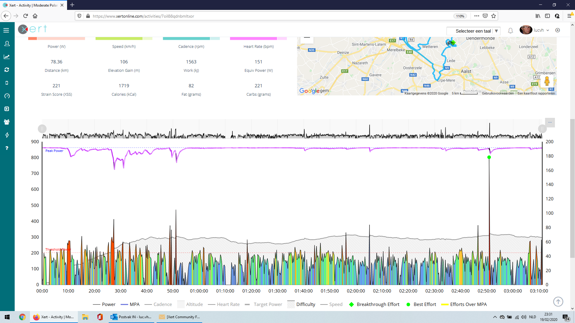
Ok I read the meaning of the colors. But: when I start a ride my focu is pe in grteen for more than 40’ in green. When I put strain: the focus goes down (what is normal) to blue. Almost at the end the focus is black. Why this evolution?
The difficulty is changing on the same number: perhaps green, perhaps blue. I don’t understand.

Power
● Blue - Well below threshold
● Green - Just below threshold
● Yellow - Just above threshold

MPA
● Orange - 180s or less until exhaustion
● Red - 30s or less until exhaustion
● Purple - Above MPA = Breakthrough

Focus
Black = Polar (less than 33%)
Blue = Mixed (between 33% and 66%)
Green = Pure (greater than 66%)

Difficulty
Blue = increasing
Green = decreasing

1 Like

Thanks for this resume!
But how do you explain:
Focus: and the end, after putting a few minutes more strain, the color changes to black?

Have you got an image of the ride in XERT?

Does this info helps?

Sorry, I meant the MPA/Power/Difficulty graph.

Please tell me more… Is it one of the progression charts?

Click on the name of the workout then scroll down to view the graph.

I learned again someting… Here it is

This isn’t that easy to explain. The Specificity Ratio is kind of like the ratio between work done above and below TP (it’s not that simple but it should help you understand the concept better).

Early in your ride there was a lot of time spent above LT as well as periods with low or no power as you recovered, hence the Specificty Ratio was high meaning pure/green specificity. As the ride went on you spent more time below LT with little time above LT, so the ratio slowly moved to mixed/blue and then to polar/black.

Thanks for this explanation. Slowly but surely I understand more and more how all things in Xert are working.

Specificity (and even Focus) is something that we have a difficult time trying to express to our users. It’s a fundamental concept of the system, but becomes difficult to express. We’re hoping to create a podcast, or maybe a video, that would help explain this concept in a clear, concise manner.