You will likely see this gauge throughout Xert (EBC app, Garmin data fields, Remote Player, etc.), here’s the quick way to read it:
1) Outer ring = HIE (your high-intensity "battery”)
It drains when you ride hard (above TP)
It refills when you ride easier (below TP)
2) Inner ring colors = intensity relative to your fitness signature (not power “zones”)
Grey: well below LTP
Blue: below LTP
Green: LTP → TP
Yellow: around TP (threshold is ~12 o’clock)
Orange: ~3-minute power*
Red: ~30-second power*
Purple: MPA (your current “ceiling”)*
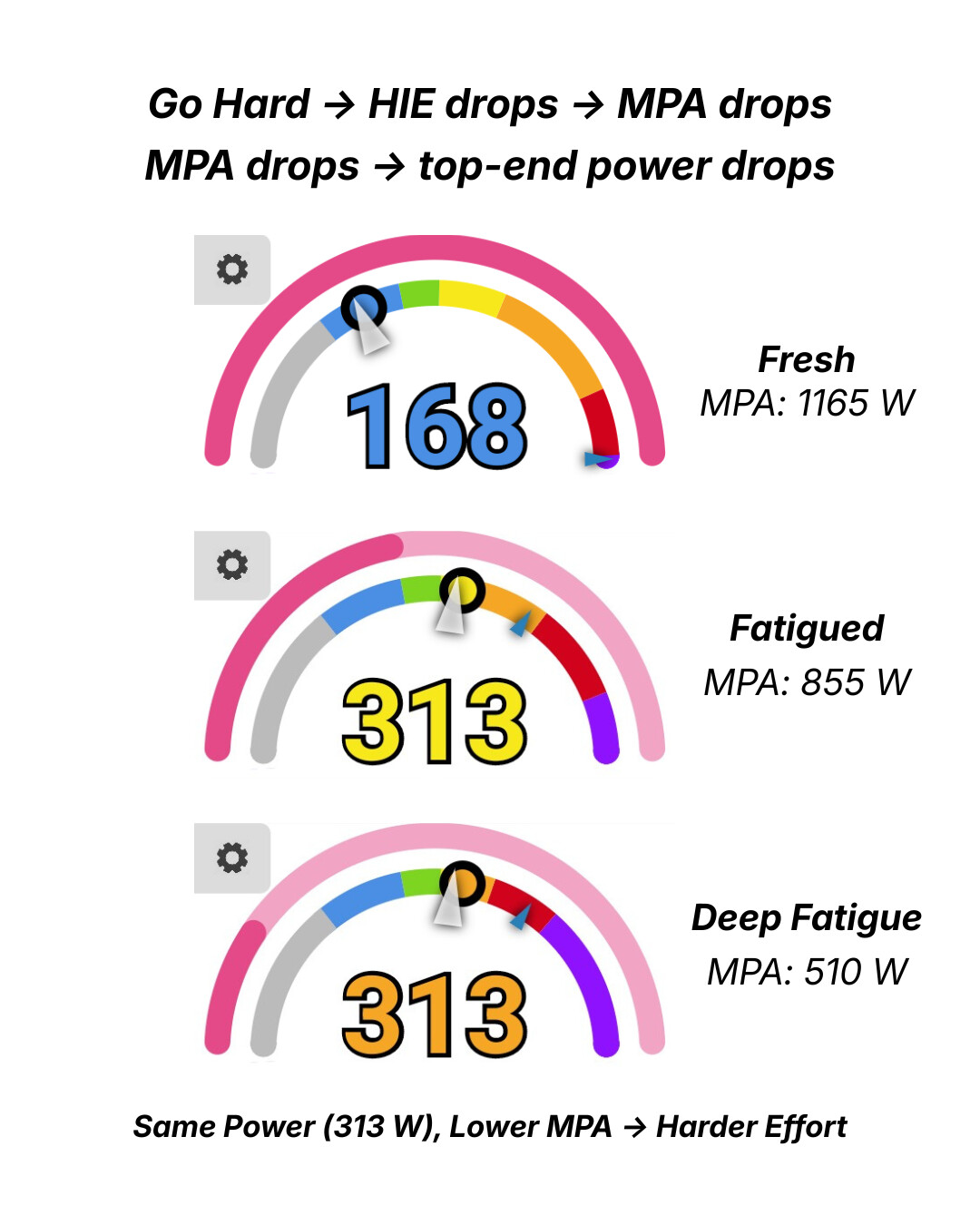
*These compress and expand dynamically as you fatigue and recover - so the colors reflect what you can do right now, not just what you can do when fresh.
Same power, different fatigue: as HIE is used, MPA drops and the purple ‘ceiling’ expands inward, compressing your sprint/VO₂ power towards FTP. Recover easy and the colors will spread back out.
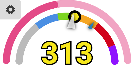
I’ve searched but can’t seem to find it. @ManofSteele can you remind me what the little blue triangle is on the intensity / inner ring? I think it may be the next upcoming interval’s target… I also am curious, in Xert EBC on my Karoo, the interval countdown bar (right near the forward and backward interval skip buttons), what do the colors of that countdown mean? I assumed it was the color of the current interval intensity, or the color of the upcoming interval intensity, but neither of those seem to be right. I think that’s especially true if the blue triangle is the upcoming interval intensity - multiple times on today’s ride the countdown bar and triangle where representing different colors, which is why this question popped into my head in the first place…
Ahhhh, got it. So that little triangle basically corresponds to the depletion of the outer ring? In other words, it shows where the line dividing the red and purple power bands will be at the end of the current interval.
That makes a lot more sense now. Thanks for the info.
Still curious if anyone knows what the color coding on the interval countdown bar (the one on my Karoo that has the forward and backwards interval skip buttons next to it) mean….
Not quite. Outer ring shows the amount of HIE remaining (which affects your MPA). The triangle shows how far the Purple part of the inner gauge will be by the end of the interval (or the edge between Red & Purple).
The purple colour for the interval progress bar indicates that the current interval is either SMART dynamic power or SMART dynamic duration (these are quite rare since most prefer their workout to have a known/fixed duration).
I think we are on the same page. It’s my understanding (though it’s been over a year since I’ve looked at it closely), that if you aren’t depleting HIE with above threshold power in a workout, the power zones won’t move at all? I appreciate the distinction between the triangle pointing to a metric in Watts on the inner ring, versus the outer ring being in kJ of HIE, I believe they should be perfectly correlated when they move.