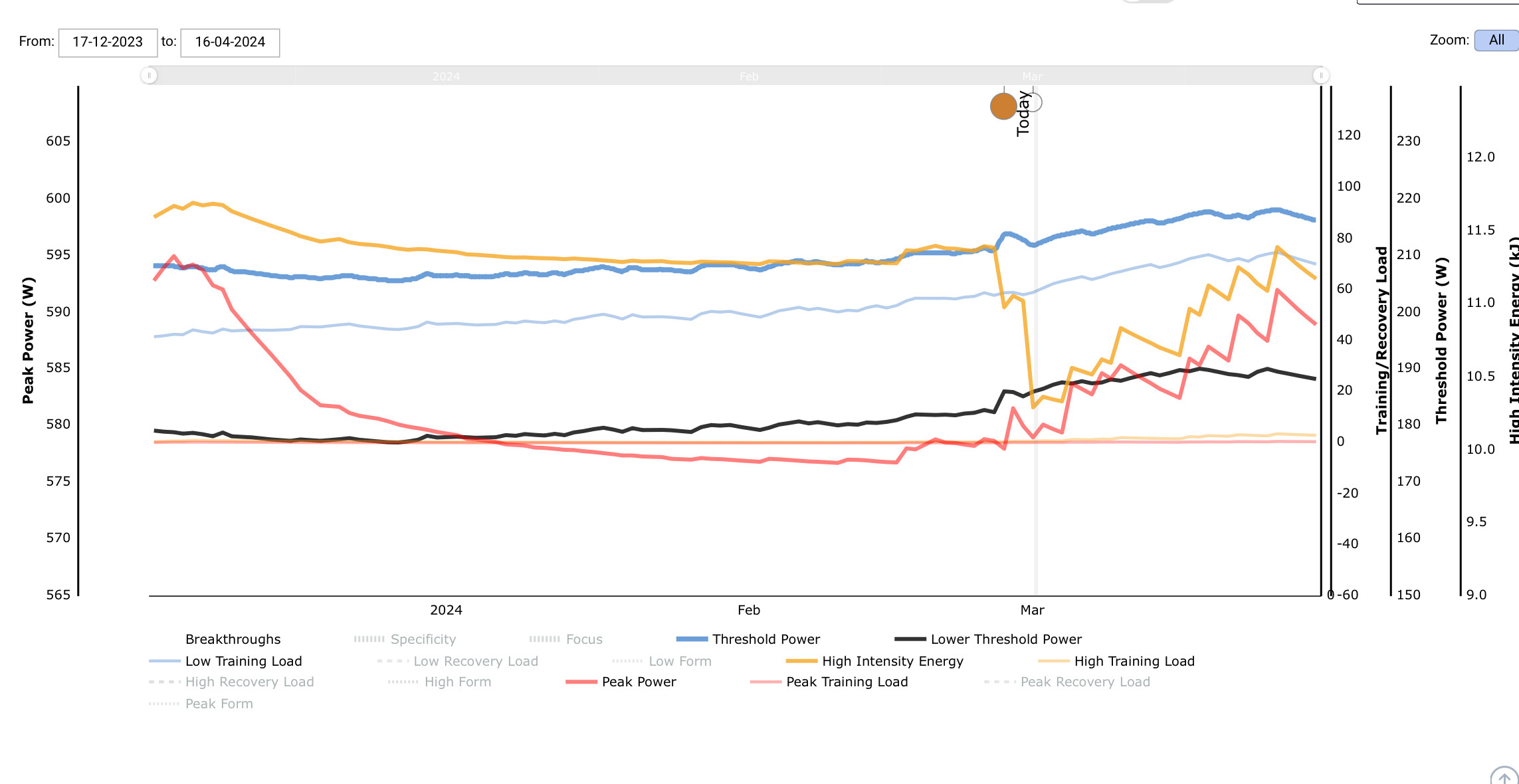
Hi, could you provide a summary of my attached graph please. I’m not sure why my HIE was relatively high for such a long time along with Peak Power.
HIE then drops quickly I think just before the breakthrough, or perhaps because of the breakthrough?
Everything to the right of Today is predicted based on completing your XFAI plan as currently forecast.
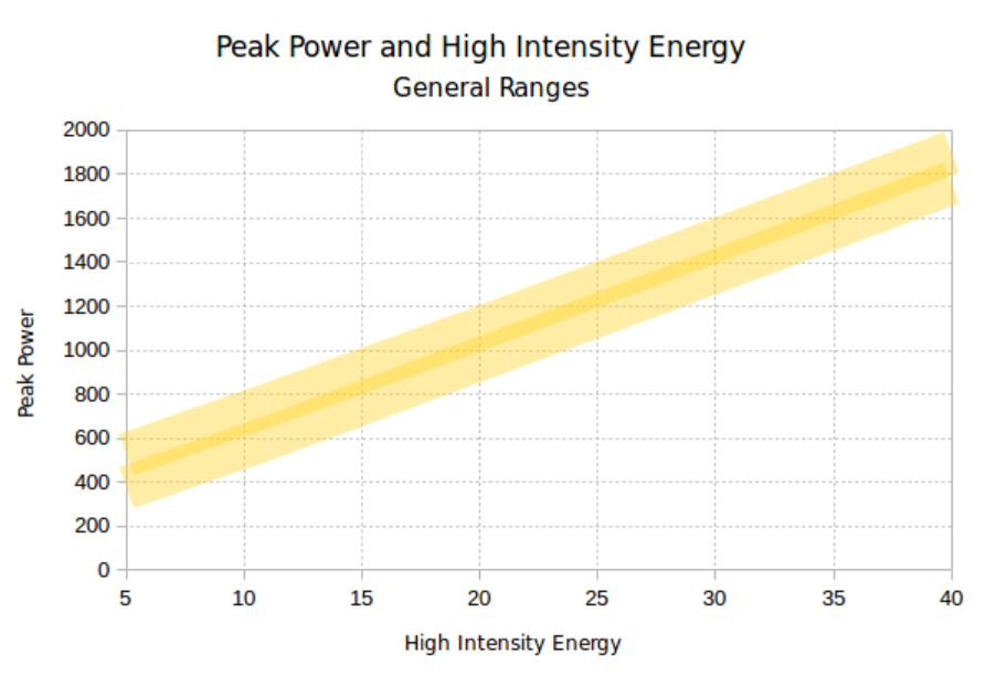
Does the adjusted HIE line up within the normal range on this chart?
Yes. 580 and 10.4
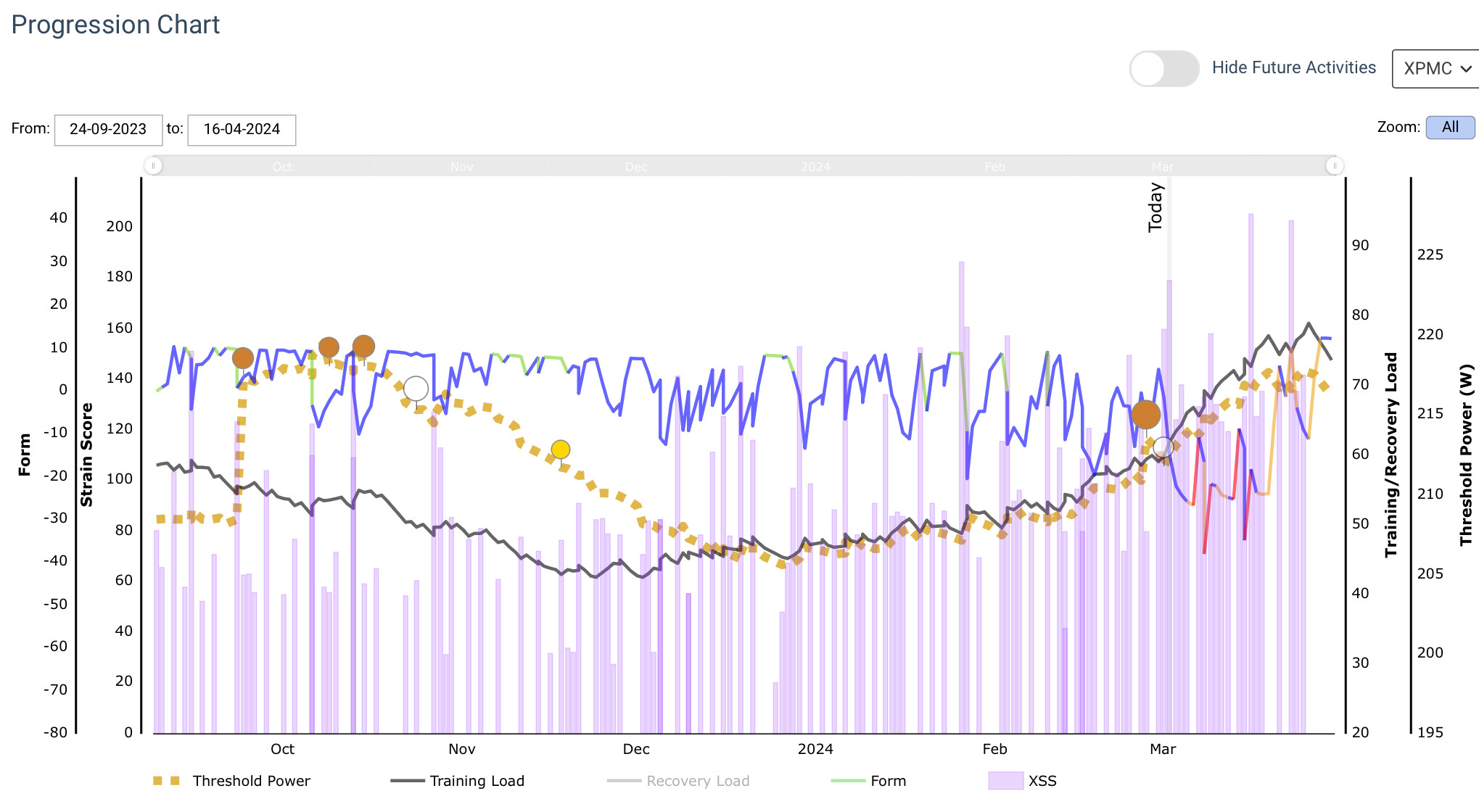
I believe I started Xert at the beginning of December. So all the breakthroughs other than those recently were calculated from imported data.
Thanks.