Thanks for updating Xert!
Xert has some really nice features, however, it is often very complicated to use. I am sorry to say it, but I think a major simplification of the UI should be done.
Here are some examples:
- There is a “Select language” dropdown on every page. Why is it there, and not just apart of the account settings?
- There is a video recording icon on every page. Why is it there, and not a part of the side bar under Help? Also, the icon is miss leading – it is not about recording, but about getting help? Or watching some videos…
- What’s new – should be a part of the side bar as well.
- Account settings (your profile picture and user name). Why isn’t that just a part of the side bar?
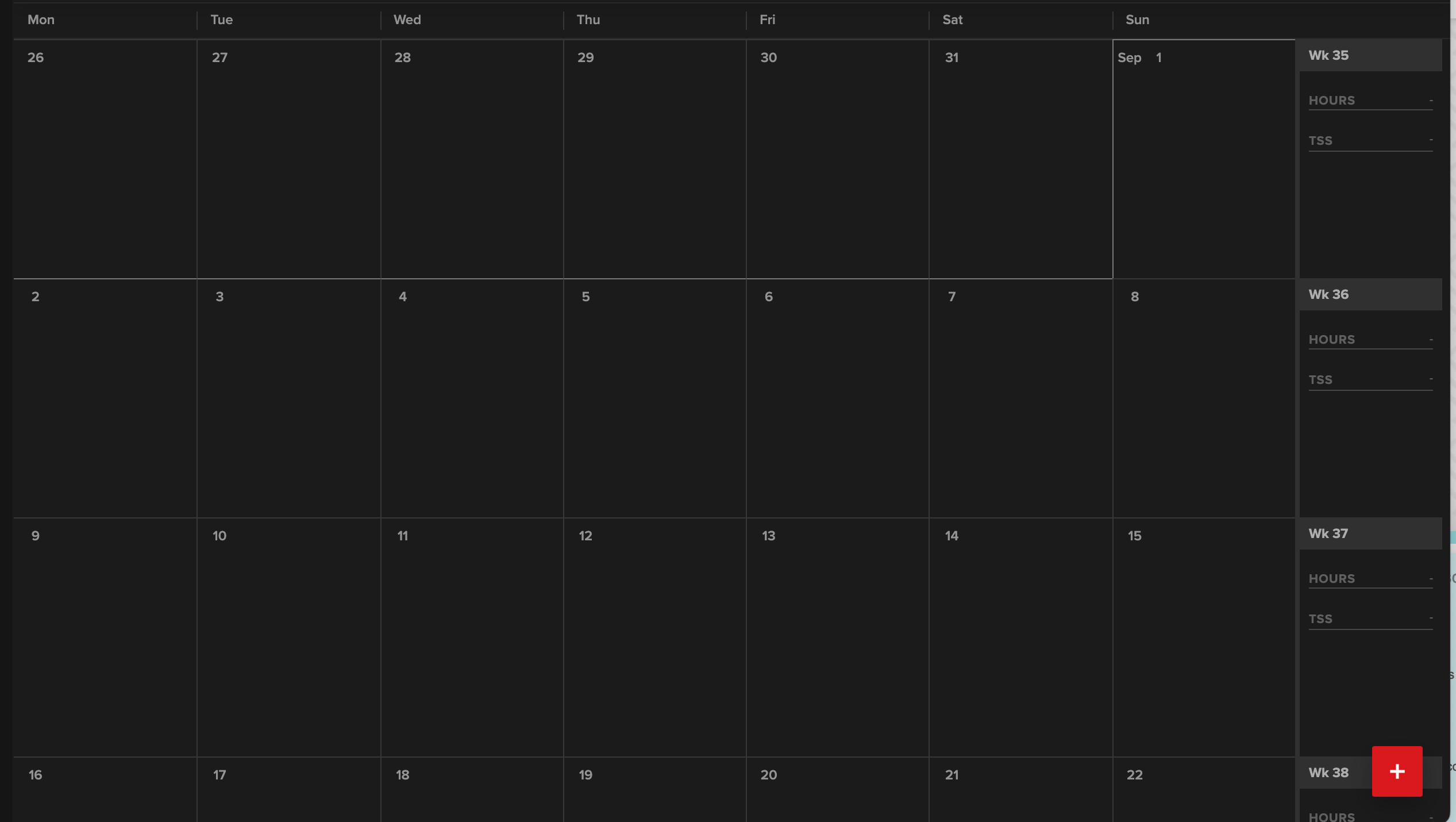
- Add (+) icon. This is not needed. Everything can be done from the sidebar.
- Under Planner. You should remove the clutter on the screen by removing the icons for adding an activity or adding a note. Just make it possible to click on an empty part of the date, and you should get a popup for adding whatever you want to add. Having these two icons for every day makes the UI very cluttered.
- If you want to show weekly stats, how it on the left or right of each week. Not as a separate line. You will typically have more than enough width, the problem is the heigh each week will take up.
- Calendar settings. Move Start of the Week config to the account settings. And use a reasonable default based on the location of the user (you already know which country I live in, why do I have to tell you that a week starts on Monday…?).
Below I have included two empty month, one from Xert and one from TrainerRoad. In Xert it is very cluttered, in TrainerRoad it actually looks like a calendar and you can easily see what is going one.