Hi All,
A few days ago, @ManofSteele posted this chart of MVP
Notice how the power is a solid colored chart with the nice zones palette
Now look at mine
What setting do I need to change, so my chart looks like that?
Thanks
Hi All,
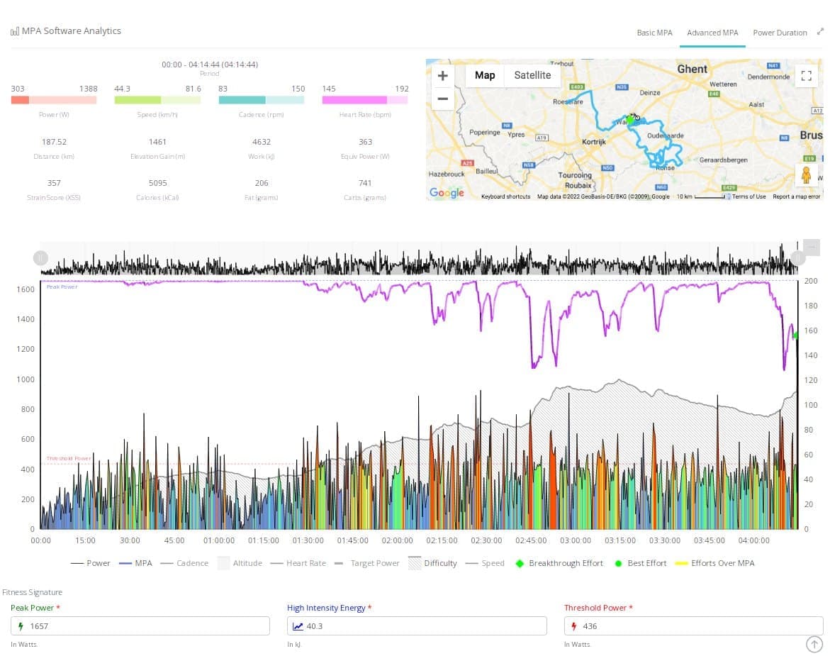
A few days ago, @ManofSteele posted this chart of MVP
Notice how the power is a solid colored chart with the nice zones palette
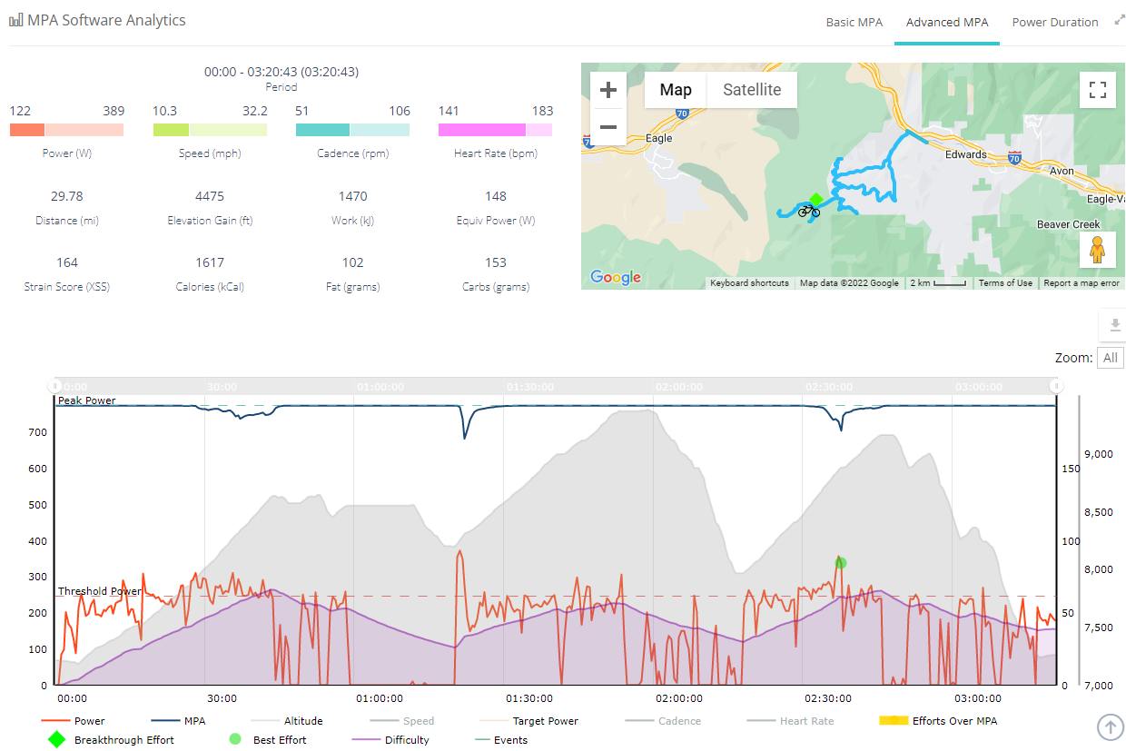
Now look at mine
What setting do I need to change, so my chart looks like that?
Thanks
“Enable Advanced Charts” in your Account Settings/Personal Info page.