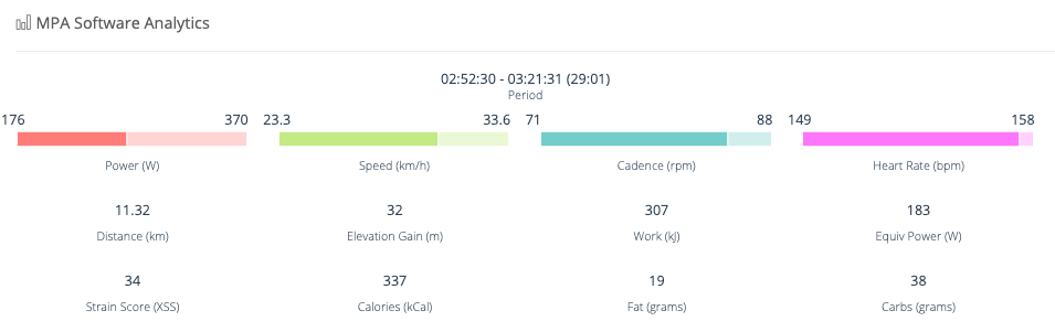
On a recent outdoor ride, I faced a huge headwind for about 30 minutes at the end of a tough ride on my way back home and I’d like to know what the average speed across that part of my ride.
So I opened the activity in Xert, selected the area of my workout, and Xert quickly showed the statistics for that period of my ride. Great so far!
… but how do I find out what the average was? It looks like the min and max values are shown and the bar visually shows where the average value is, but I can’t click, hover, etc. to get the average.
You are not missing anything. Xert is amazing on many points but the user interface is quite messy. If there a priority to refresh UI, this is certainly that one you attached.
True, but I can see why it confuses people. Like the bar between them is showing 0 to max, the average being the darker shade. Kinda confusing, isn’t it?
Anyway, I think the fact that these metrics historically have little meaning to Xert’s calculations, it’s probably something that was added by request, but not in an easy to understand format…
Not quite, as explained above… Left number is the average, which is shown as/at the end of the darker shade of the bar, starting at 0 and having the max value mentioned at the end/right of it.
Weird graphical representation, but thanks. I’m less interested in the minimum value, but now my understanding of the graphic begs the question … what was my minimum speed during this time?
(I’m not actually asking, but if there’s an answer … )
Hover over 23.3 in your screenshot and the tooltip will say ‘Average (Period)’.
Hover over 33.6 and the tooltip will say ‘Maximium (Period)’.
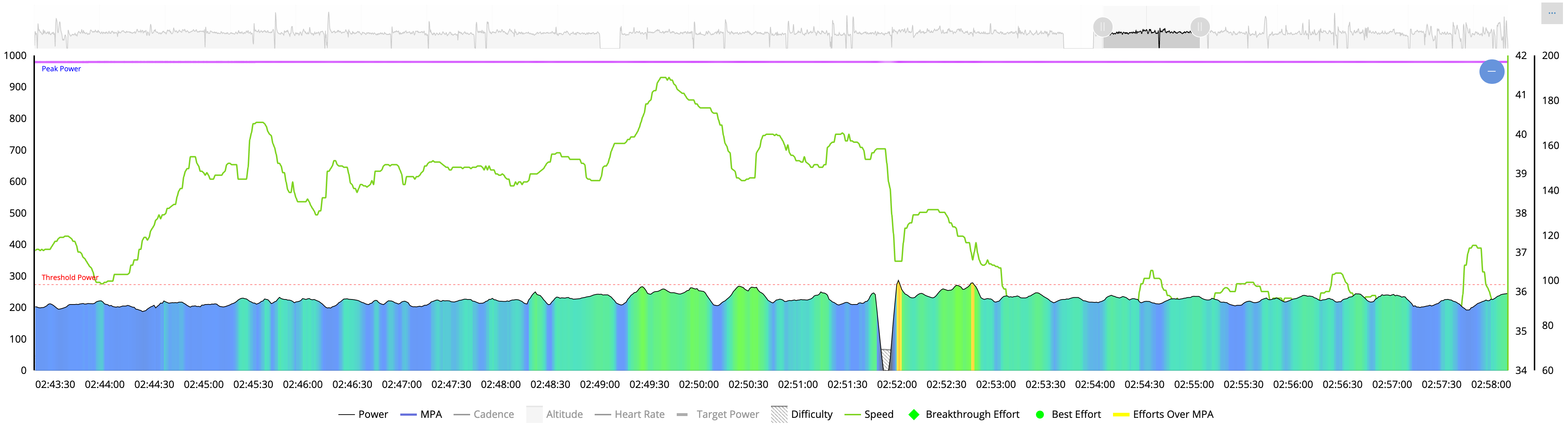
Click on Speed bar in the key below the graph to display speed. Mouseover will display speed for that point on the graph. Minimum will be obvious.
Not really, except maybe that it’s somewhere near the figure displayed to the right. Look at this: can you on that line distinguish my minimum speed for that period and how close it is to 34?
This is a zoomed in portion and the speed line drops below the power line, so no visual. How is that obvious? Other then, once again, it’s close to 34…
I get that, but it’s not obvious. I can mouse over and see my speed, but it could be listed at the top. You CAN make it (more) obvious, if you take out all other data. And even then, it reads 34 when you hover over the lowest point on the graph, but it’s half a cm above the 34 to the right…
There is, kinda - it’s most likely the value shown to the bottom right, if you enable the speed graph. Not sure if that is an exact match, as it is probably rounded to the nearest full integer.
Agreed, it is not obvious how the chart works especially to newbies.
What’s lacking is a help page link that details what’s what or better yet a link to a how-to video.
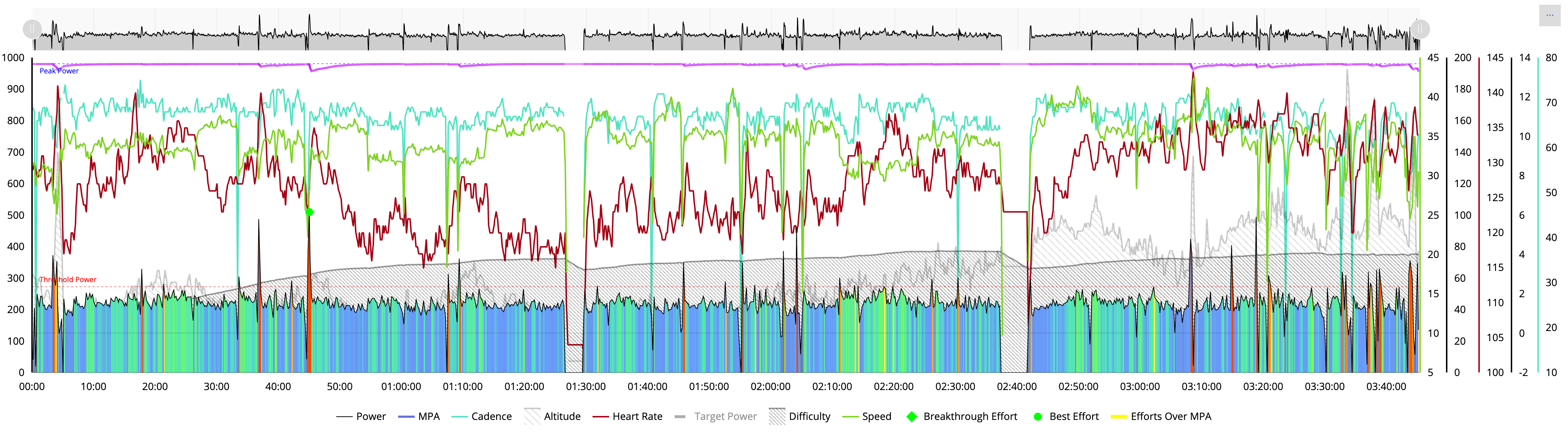
Otherwise the graph has a learning curve. Once you understand how it works I think the chart cleanly displays data points without cluttering up the interface.
Other platforms tend to dumb this down by displaying multiple graphs instead of one graph to rule them all.
I never really care for anything but my average power and possible details on how that looked over the course of the exercise. But, as I’m a typical flat liner - unless you really zoom in - there is no interesting data to pull from my graphs.
It basically looks the same, one hour after the other
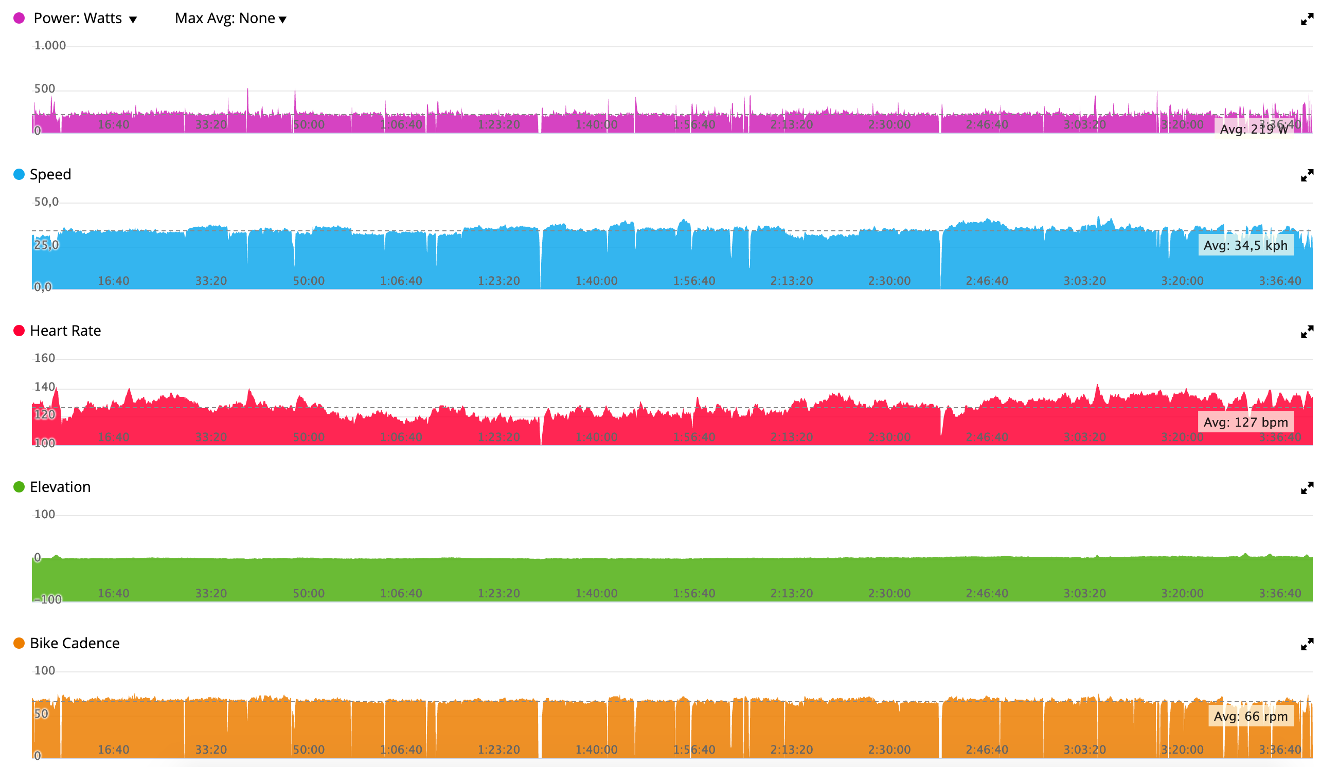
So you can if you want display each data set one at a time like Garmin does but as you mention that’s not obvious to many users.
Xert could do the same thing by adding a toggle option called Display Combined (the default) vs. Display by Key. When clicked the page expands to display stacked charts based on the data sets you selected. They could also include stats in the title bar (min/max, avg).