I am loosely following an XFAI goal plan and tend to overshoot daily targets if the weather is especially nice. I’ll sometimes ride much more than the XSS goal.
That revs up my Recovery Load and pushes me into red for longer periods (rest/recovery required) or red to yellow (endurance only) before a return to blue (ready for more HIT).
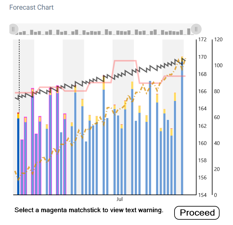
A large overage can light up the calendar with a number of magenta matchsticks (broken constraints).
I like to review the reason for any broken constraints.
Currently you do that by selecting the Program tab, scroll down to the Forecast Chart, and hover over or tap any magenta matchsticks to view the warning text.
If you skip that step and run Adapt Forecast immediately, you lose the opportunity to discover why you may want to adapt.
What if the Adapt Forecast button was a two-step process?
When the red dot warning appears, selecting the button would display the Forecast Chart. It does this now but immediately takes off to optimize and rebalance the plan.
My suggestion is to stop at the initial chart display with the magenta day(s) shown.
You can then hover/tap those days to view the text warnings – if you want to – then select Proceed to complete the adapt process.
At a glance you can see how many future days are affected and investigate.
No need to exit the Planner page to view the chart under the Program tab.
Tapping Adapt Forecast would look like this –
Would you use this feature to check why a constraint has been broken?
- Yes
- No
- Sometimes