Ranking Spider Graph and signature diagnostics?

When one looks at the ranking spider graph is it reasonable to say that the section from say 12 noon to 4 o’clock is PP dominant, from 4 to 8 o’clock is more TP dominant and the 8- 12 is more HIE dominant signature wise? When I look at my graph the sections that seem low are those that have a higher endurance component, while the other two quadrants are higher to moderate. Is this a useful way to interpret strengths and weaknesses in relation to your signature triad?

I don’t think the triad can the tied to the spider chart in that fashion.
The chart represents points along your power curve (compared to others) starting with Power Sprinter (10 sec power) at 12 o’clock and proceeding clockwise to Triathlete (3+ hr power).
Athlete types fall roughly into quadrants as shown in my mod of the help file chart –


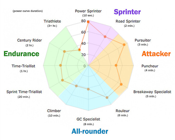
The points on your chart represent what you are better and worse at but also what your training preferences reflect.
Someone with a rounded plot has hard data (literally) to prove their comparative max level at each of those duration points. Someone with a star-like plot (like me) is better at their high points and either weak at the others or doesn’t train or ride hard enough at the other durations to rank higher. This is influenced by your athlete type selection and how often you use Filter to choose a different focus while training.

You can work on a strength or a weakness by targeting a specific focus duration for weeks at a time. You’ll know soon enough if the chart accurately reflects your capabilities once your workouts/rides are testing that duration on a regular basis.
In my case I rarely hammer for any length of time and avoid long interval workouts so my TT quadrant is shrunk to the center. I’m also not overjoyed when longish VO2max orange/reds show up on the recommended list. :slight_smile: YMMV

2 Likes

Well here is something to think about and again maybe I have missed the boat on this but here goes nothing.
PP increase raises the top of the power duration curve all else equal just the flatish part at the top of the y axis moves.
TP increase raises the tail of the curve, all else the same
HIE increase shifts middle part to the right.

If these statements are correct then it affects your types based upon what they excel at? I know in past there were definitions of athlete type by the power duration curve \characteristics.

Since the power curve defines the triad of your signature then would it not make sense that the mix of HIE, TP and PP relate to specific athlete types as well? I am just asking?

actually your colouring is a bit off and should align with the data point lines…(the sprinter colour shaded area is from infinite to between 2 and 3 minutes) but the key point of the spider graph is as you move around the circle the duration gets longer and that aligns with the power duration curve. So at each point around the circle that states where you are relative to the population of the data in each time duration point on the curve. Ie GC Spec is the 8 min duration power, and in the diagram above they rank about 50% of that data group. In other words the spider graph appears to indicate your strengths and weakness in a clear and understandable way ranking you vs the maximum levels in your comparison group.

The big question from an Xert point of view is what methods are prescribed to work on weaknesses. Or alternatively when in base phase I would assume that the prescription would be endurance with the intent of increasing these area of the PD curve. I think it would be really useful to be able to see your spider graph for different time points (1, 2, or 3 months prior or last year at same date) overlaid so you can see how your signature changes and how that relates to your spider graph strengths and weakness over time?

1 Like

+1 on this, I want to be able to extract out predicted spider values over time…you can do this for your selected athlete type, and export from the activities table (I think from memory) - but I’d have to do that once for every athlete type…(then again, its a pain, but maybe its doable…)

You’re right. It’s a line drawn into a circle but the ends shouldn’t meet so I’ll need to insert a gap in the colors. [Edit: Done.] Otherwise I think it gets the point across that athlete types are points along your power curve that roughly fall into quadrants as described in the help files.
They could have created something similar with overlapping power curve lines in a standard graph format, but I think the spider chart is a simpler way to represent the data.

I don’t think you can draw strict strength/weakness conclusions unless you consistently test all points along your power curve. Those competing may be doing so on an irregular basis but enthusiast/recreational riders like me aren’t doing that at all. The chart reflects what we like to do probably because we are reasonably good at those durations when compared to our demographic. :wink:

Reference:
Athlete Type – Xert (baronbiosys.com)
Choosing your Athlete Type – Xert (baronbiosys.com)

As for your timeline idea for the Ranking page how about this enhancement?
Add a slider below the three charts that sits at today’s date by default but you can drag the slider to the left and watch changes to all three charts over time.
There could also be a Play icon button where you drag the slider to a starting date in the past then click Play and the slider starts moving (one activity at a time per sec) until you pause it or it reaches the end (today’s date).
Or two sliders are shown by default next to each other on the right (today’s date). You drag the first one to the left to set a start date and the second to set an end date, then click Play and watch the charts evolve for your defined period.
The start/end date limits are controlled by the time period filter you selected.

1 Like

I like your idea on how to see past performance on the spider graph. You may be right on you do what you are good at, but on the other hand if you are trying to use the charts to improve a weakness then being able to see progression on this chart is an elegant way to do so. Say I started 2 weeks ago trying to improve my 10 minute power… it would be very nice to be able to scan this chart from then until now to see how that has changed. Since Xert is supposed to help you train, and training is supposed to improve your weak points this would be a great way to \visualize it. I really like your idea!

1 Like

Like the idea of tracking / visualizing power at focus duration over time, but not sure it needs to be via spider chart… why not just in xpmc? So far you can see development of each signature parameter, but not how they combine at your chosen focus (at least not to my knowledge)

Only other comment is that some elements of the spider are absolute while some are per kg, so it’s not purely signature driven… weight is quite a big driver of some of those rankings, and a reason most bigger riders will struggle to get high climber ranking (which is reality of course)

though that may be true it still is a reasonable way to see how you change over time. Even if weight were a factor and you maintain your weight accurately in Xert, this can show that impact over time as well… By overlaying or seeing the change over time you can see how this is changing you focus and abilities.

Hmm…How about showing a vertical gauge for your signature values and weight?
It could be a tall rectangle between the Personal and Population circles:
PP HIE TP Wt
When you drag the slider (or play the animation) you can watch those numbers go up/down on their gauges as well.

As far as absolute versus W/kg that’s determined by the athlete type selected which you can change by clicking on Goals and the Persona/Population circles change accordingly.

I think the Progression charts stand on their own but the Ranking page slider/animation concept would be a slam dunk way to visualize your KPI changes over time.
Likely hypnotic to watch too. :exploding_head:

1 Like

Yes I could get behind this idea, we need a way to up vote these great ideas to Armando and Scott!